
To begin with, we wanted to focus on the core gameplay, which is fast movement with hacking and slashing.
To diversify the attacks as the game and story progresses, we wanted to add special attacks. Each level boss would be using an ability that is gained by defeating them. This would culminate into a large arsenal of movement and abilities to deal with the increasing hordes of enemies.
It was decided early on that we wanted to pixelize our game through a shader to reduce the fidelity required in 3D modelling, allowing for a more polished look within our short timeframe.
We incorporated rogue-like elements by separating levels into sections of hordes to be fully dealt with before continuing. This would also stop the fast moving players from skipping sections and gathering huge hordes behind them.
This final version includes all the abilities (due to the cut levels), all the enemies including the boss and the NPC interaction for worldbuilding and story progression purposes.
After these first versions I suggested extending the tree in the foreground to use as the menu.
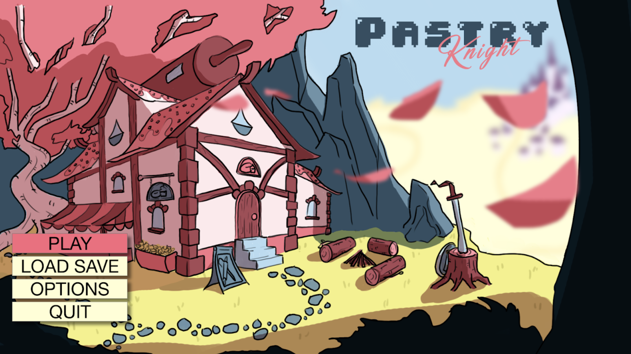
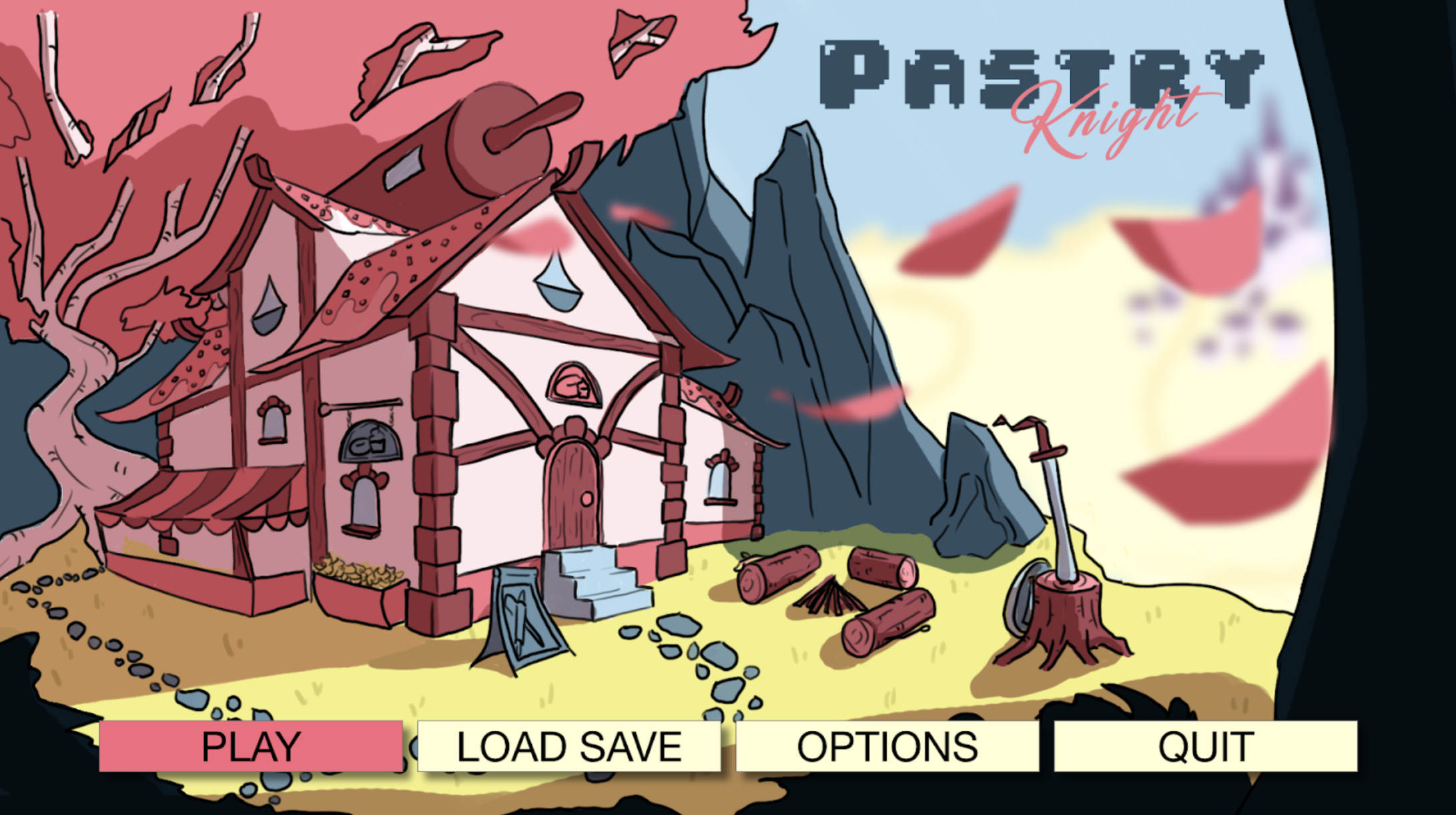
This version (left) was approved by the rest of the team, only changed later (right) when assessing the font choice for the UI.
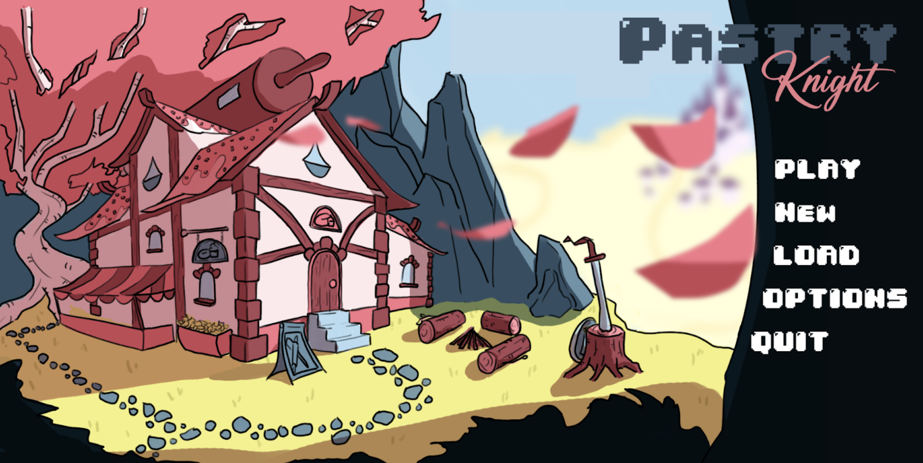

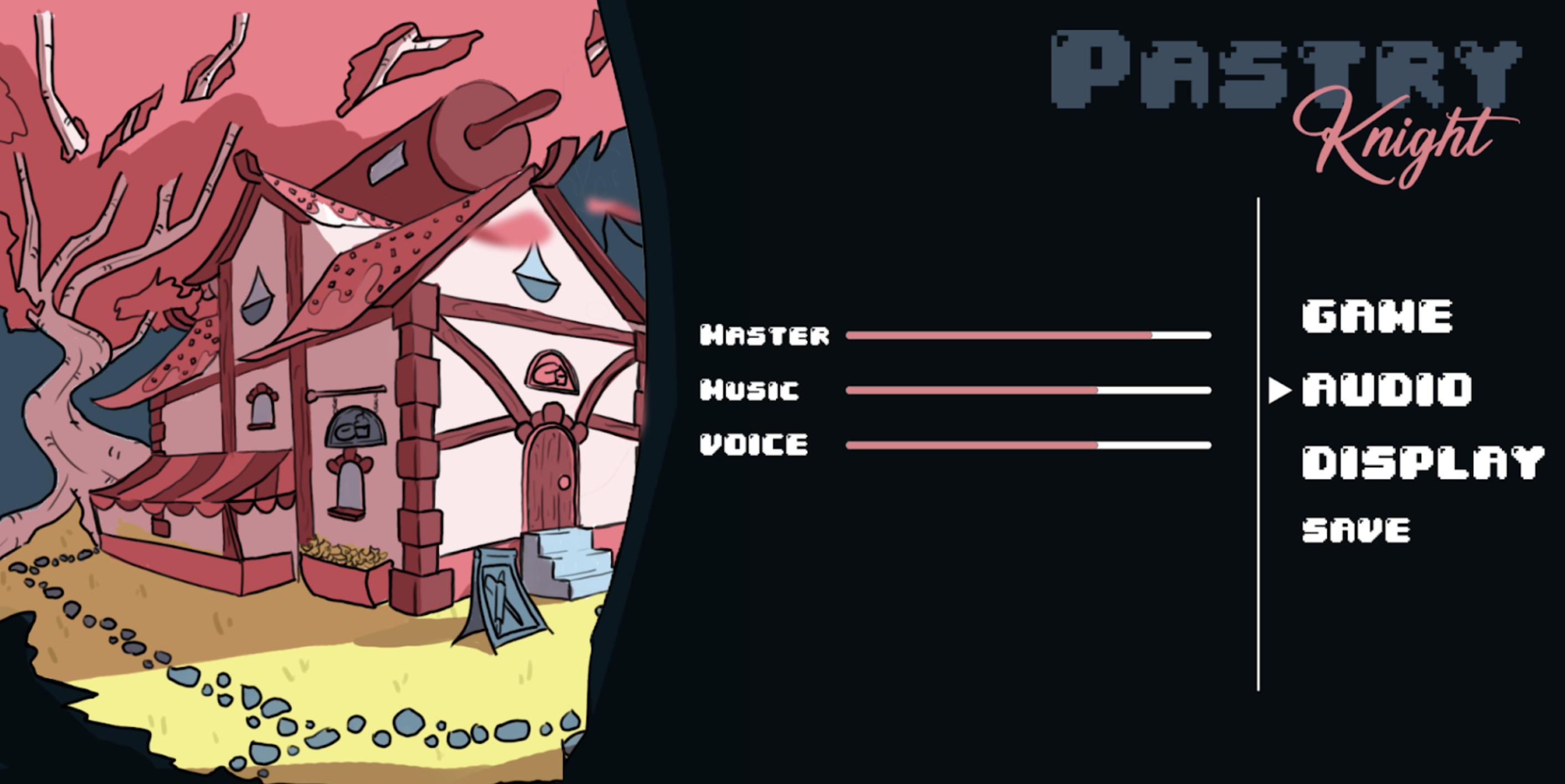
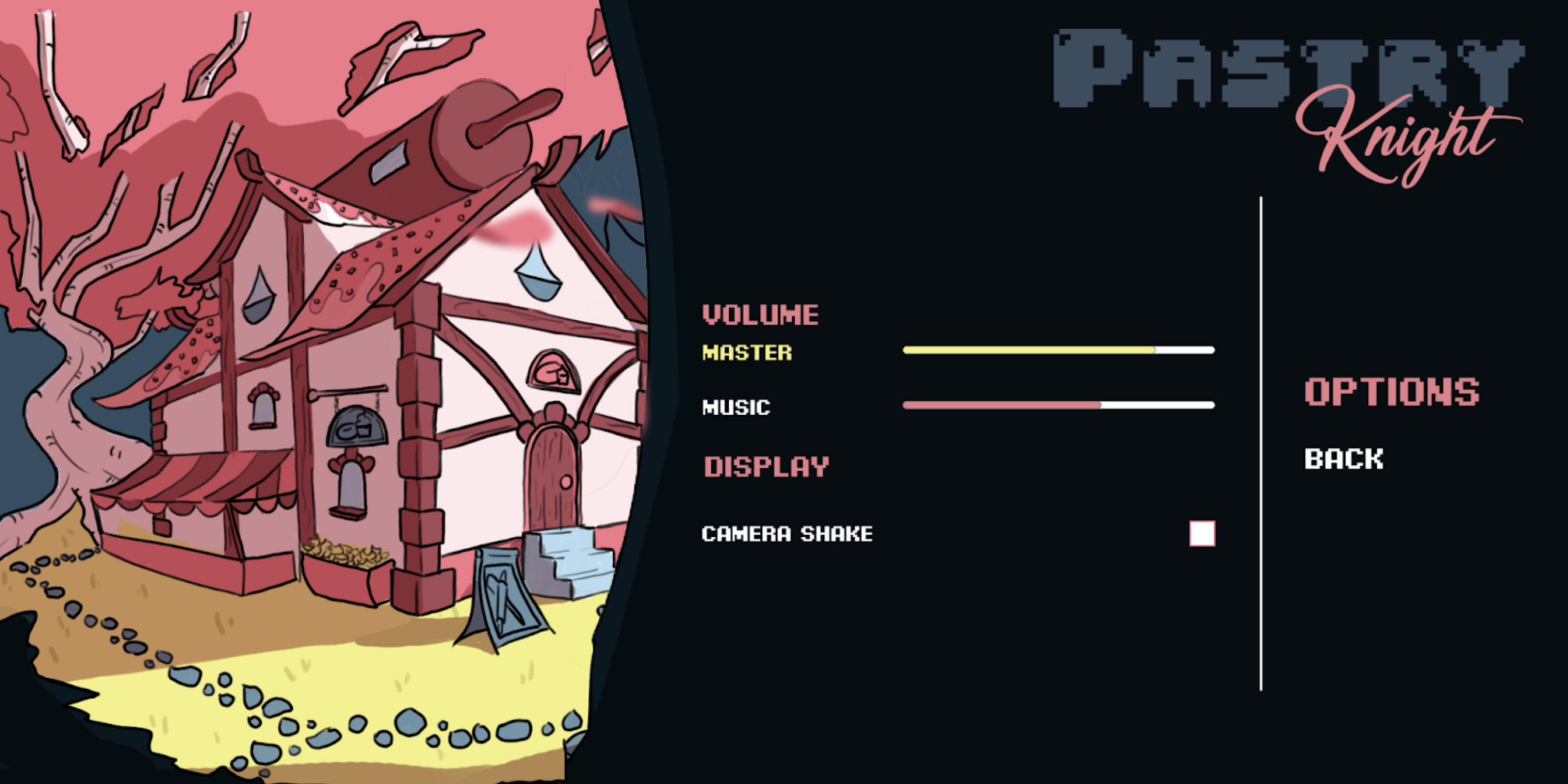
Following my idea to use the foreground tree, we used that to accomodate the other parts of the Main Menu.

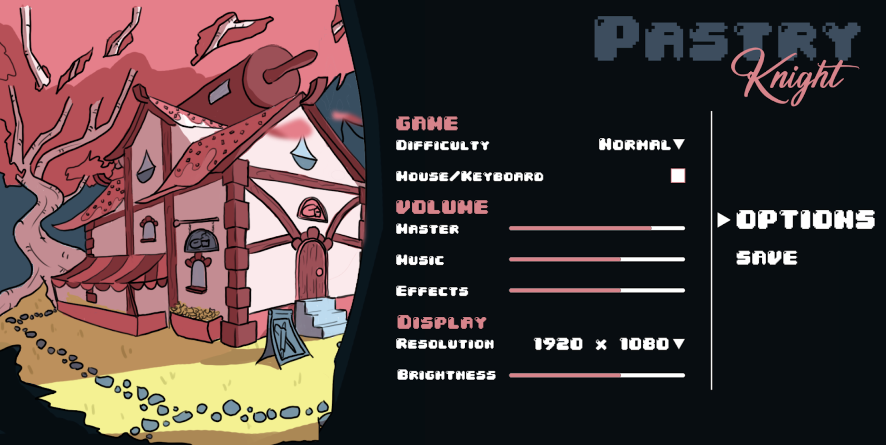
We originally proposed many functions in the options menu but due to constraints on the programming side we had to cut them down. This was the result before and after the font change.
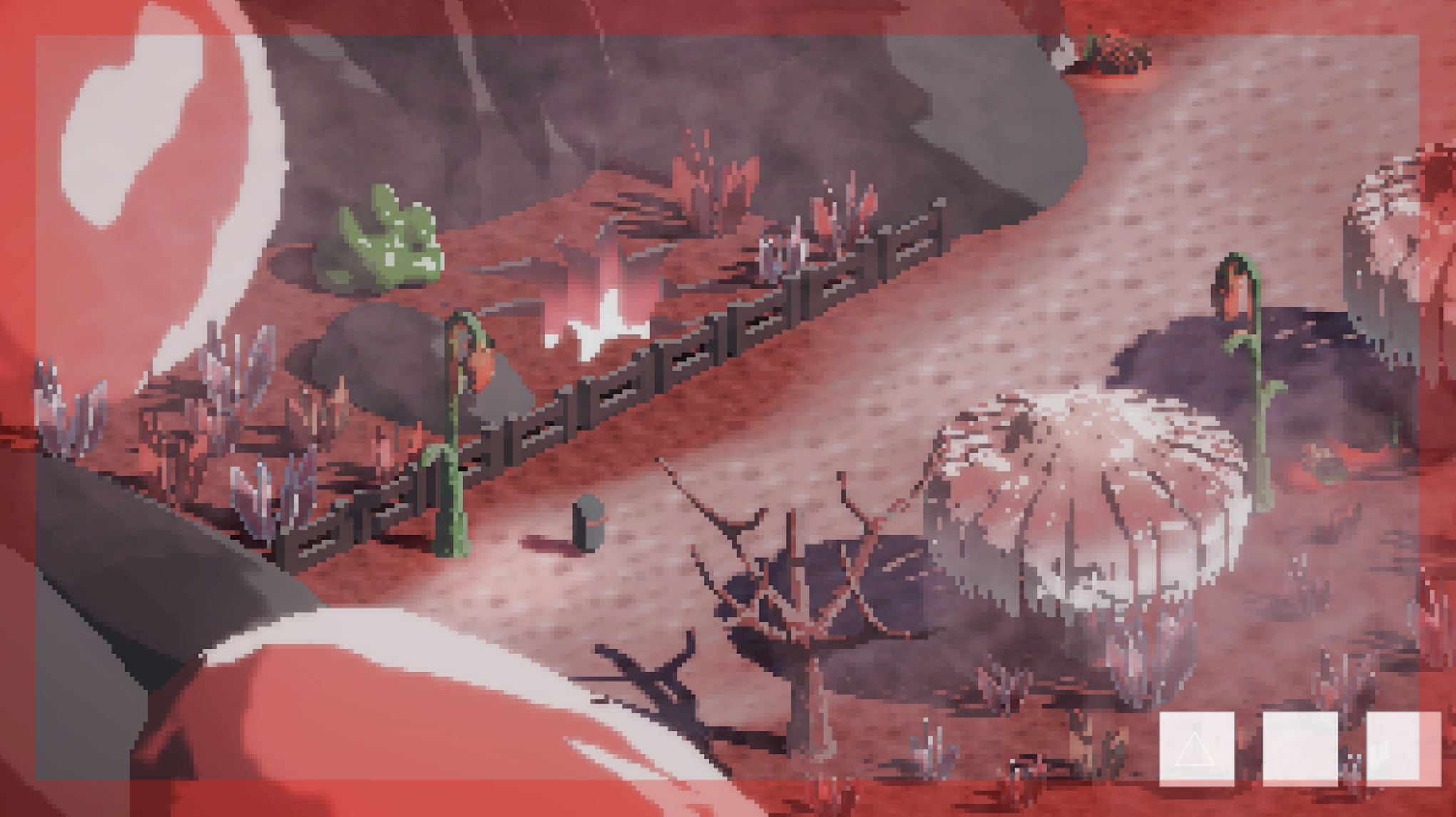
Originally, we had planned for a non-specific health indicator using a 'blood' border to indicate damage, increasing until death. This would draw focus away from specific UI elements and into the fast paced gameplay, forcing players to play by feel and instinct over calculation.
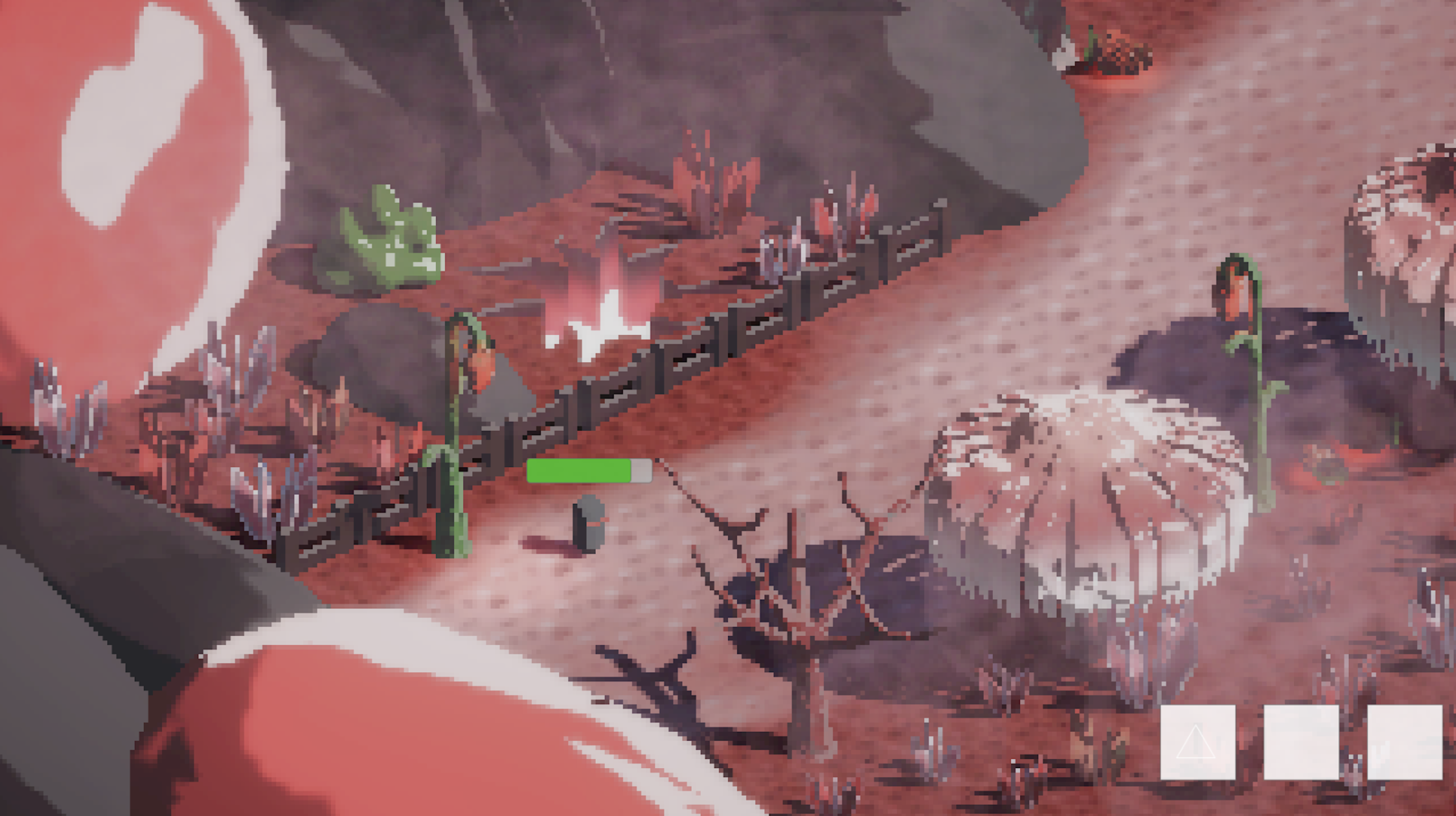
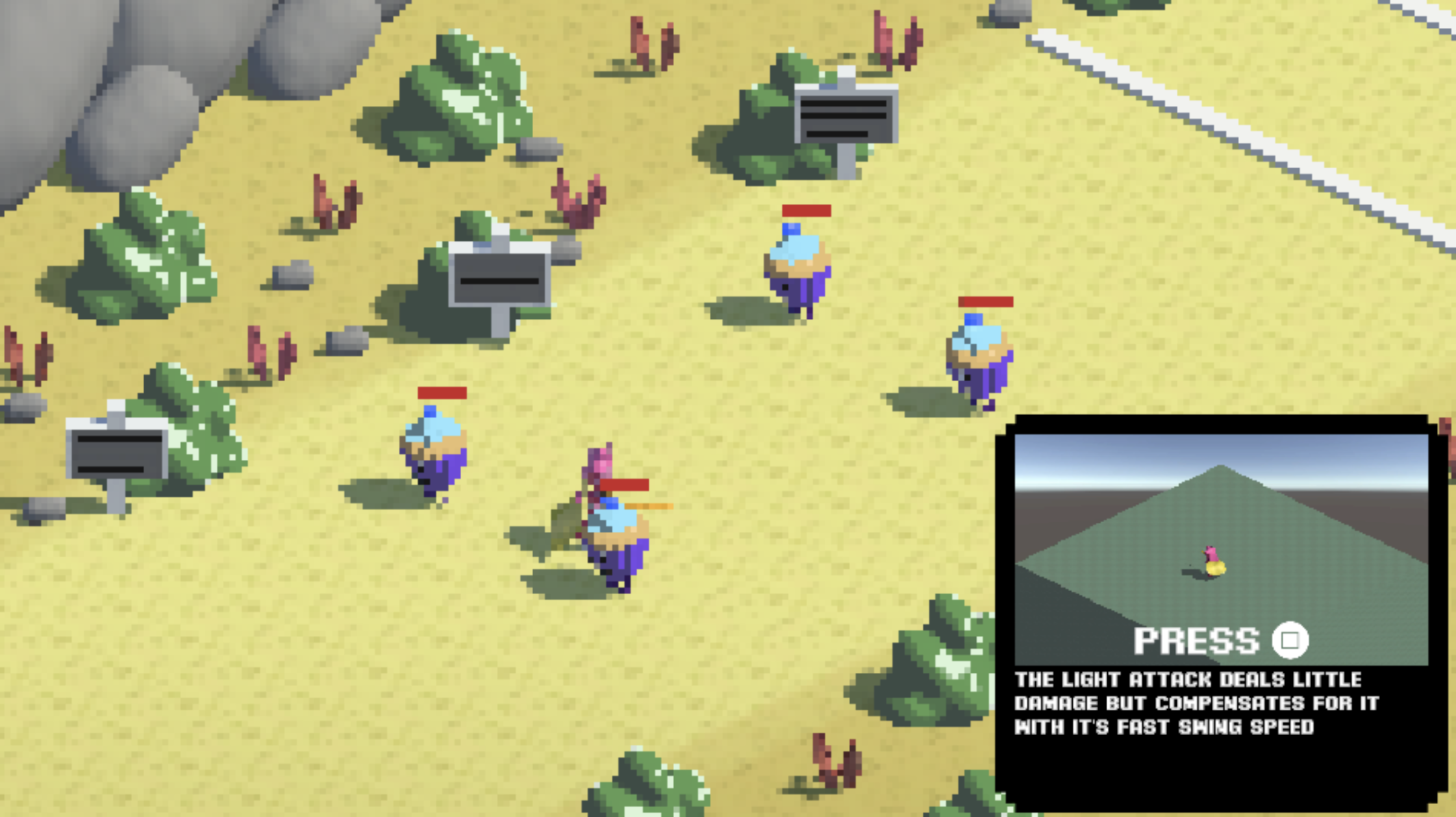
We tested a version with health above the player but quickly found it to be confusing, distracting and overcrowded next to enemies, and it makes the player character feel disempowered as they are treated the same as an enemy unit.
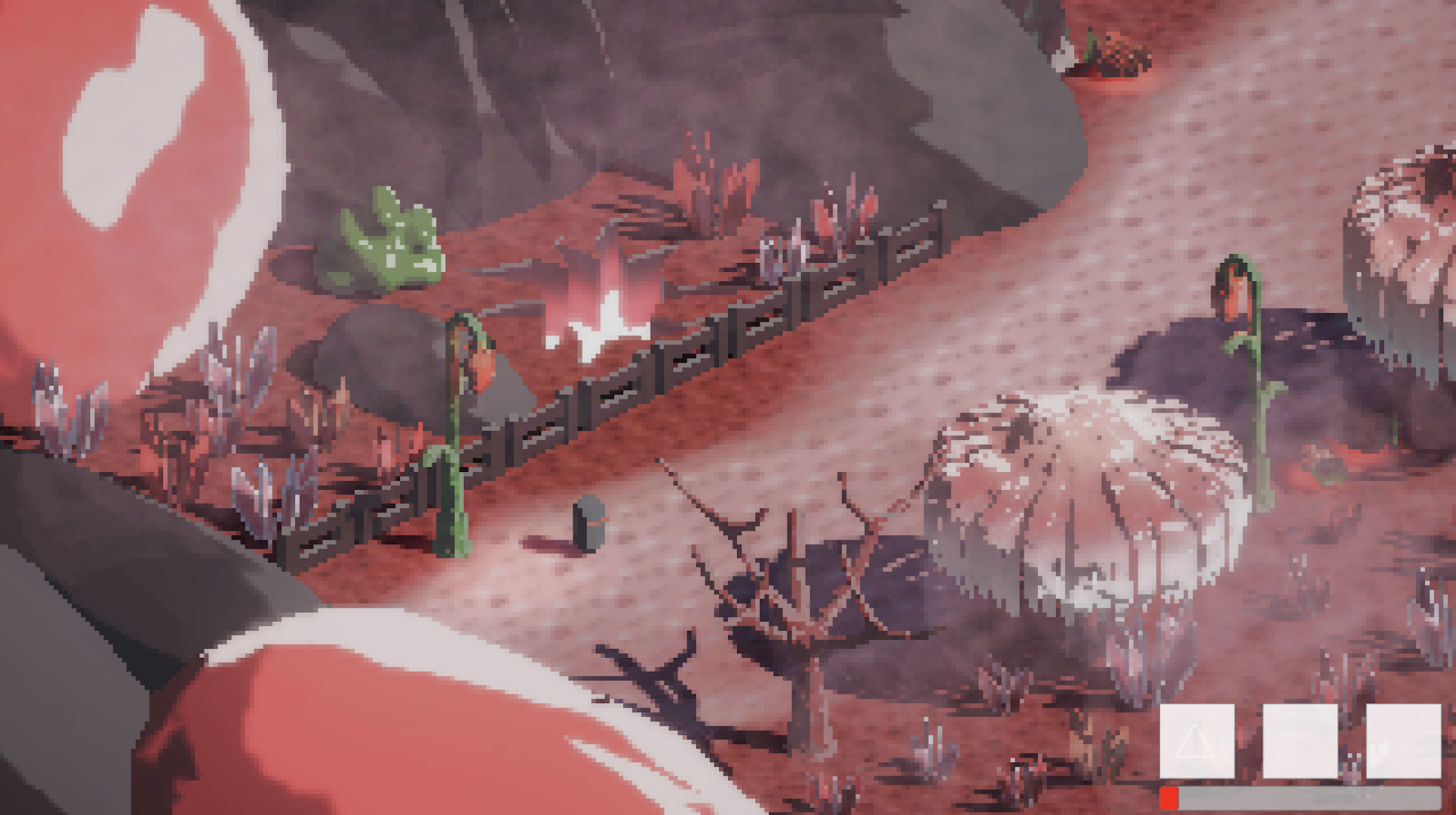
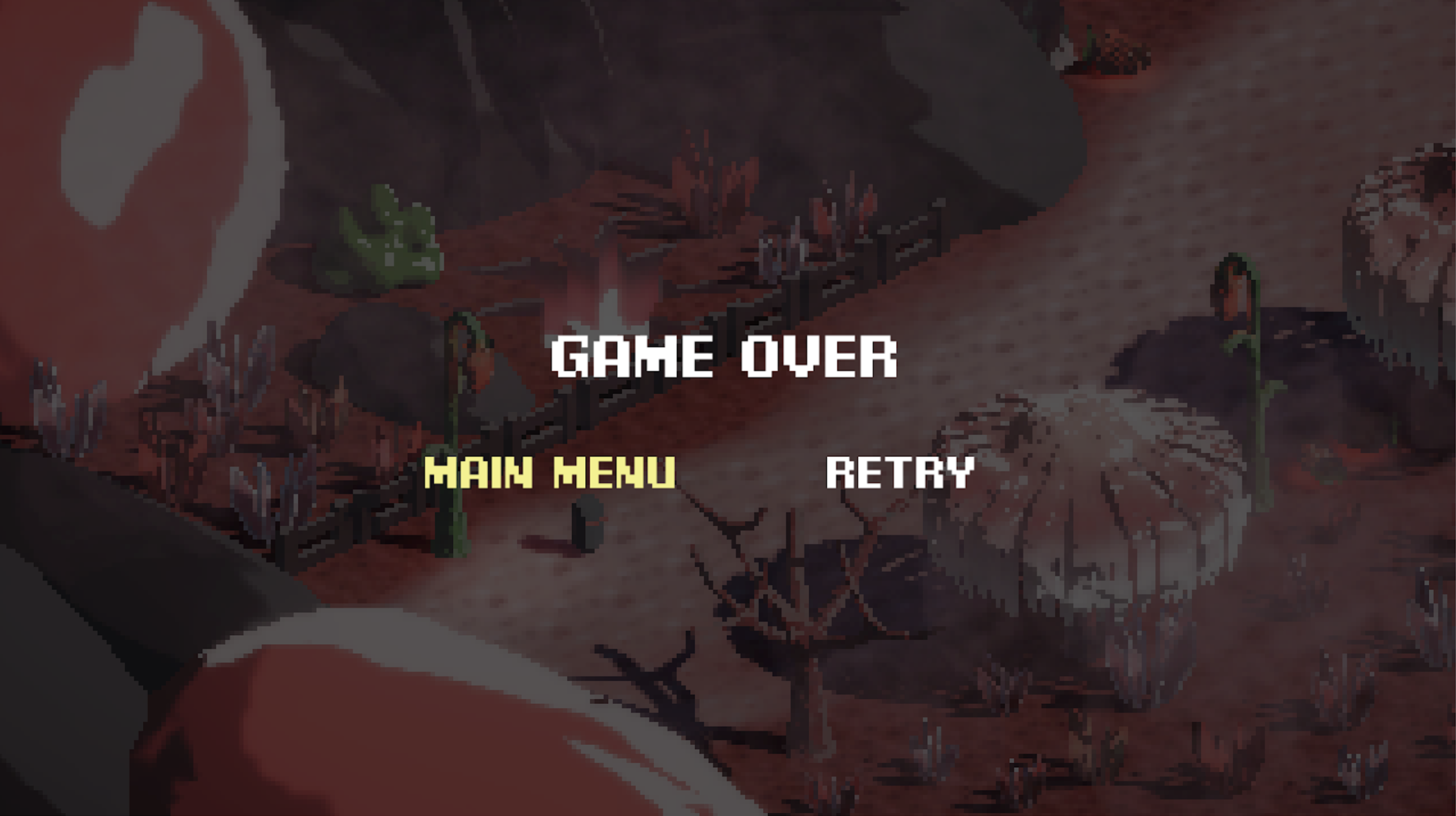
The team opted for a health bar on the bottom right next to the skills in the final version. Personally, I think the border health version would have been more fun, immersive and visually cohesive, and more importantly, I thought it would aid the fast paced nature of the combat.



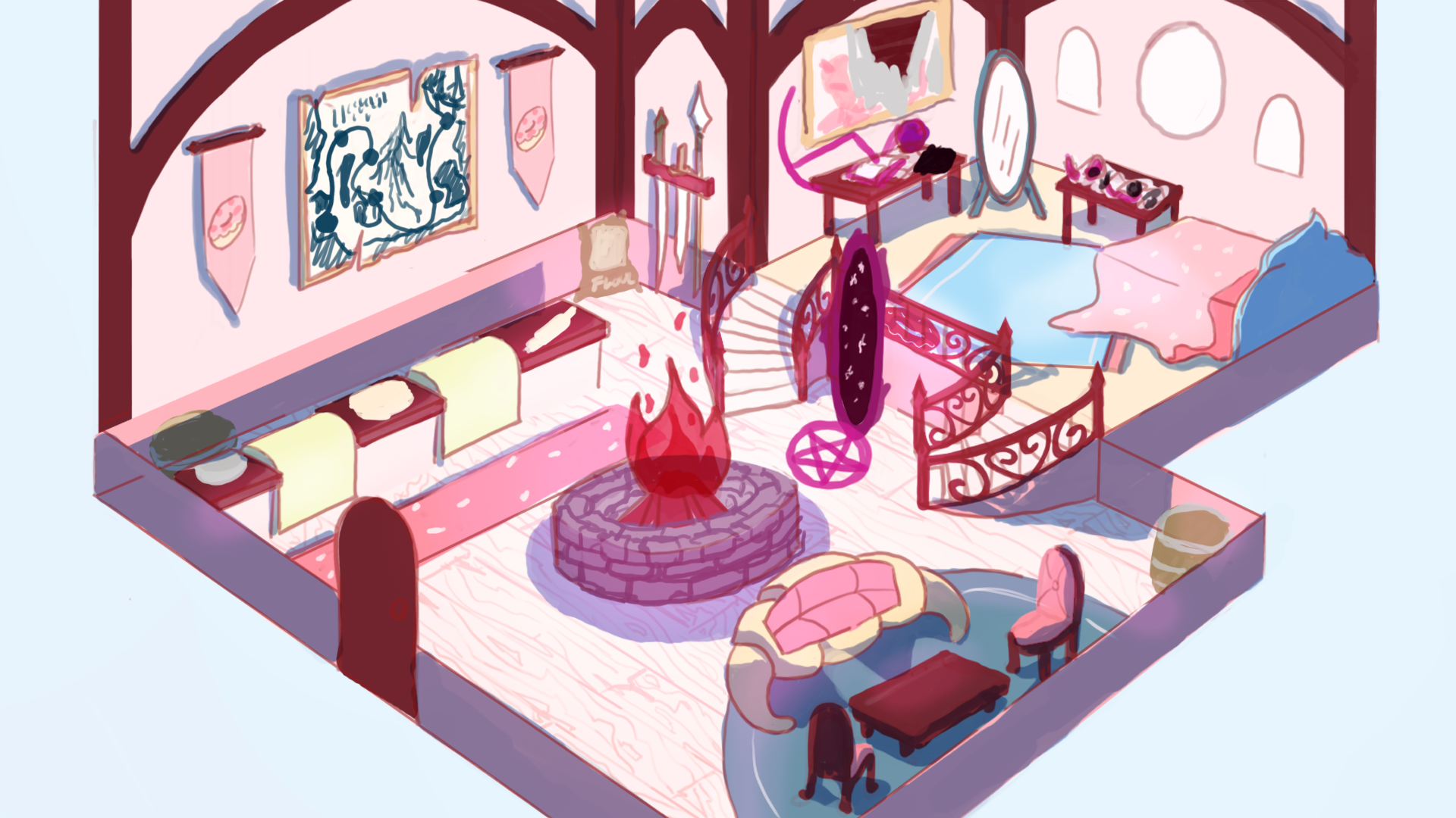
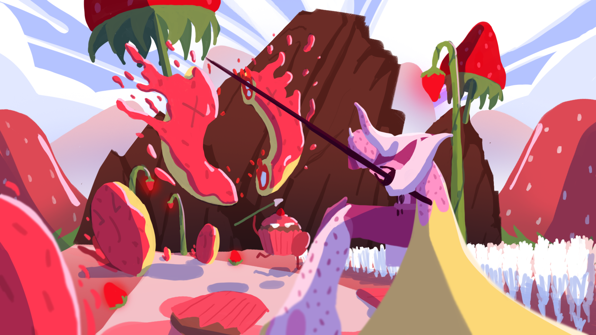
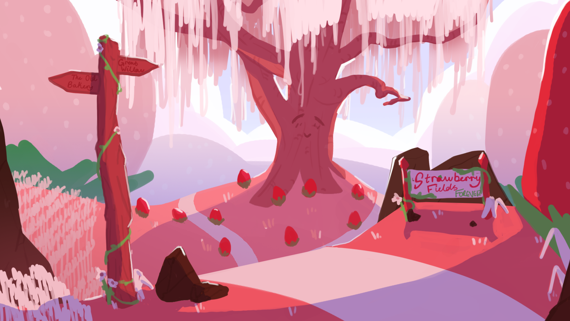
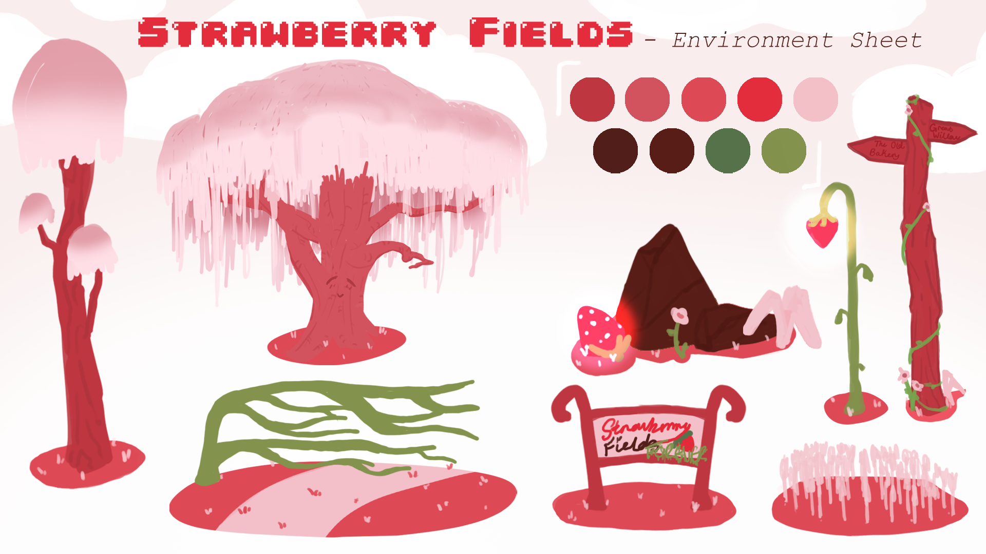

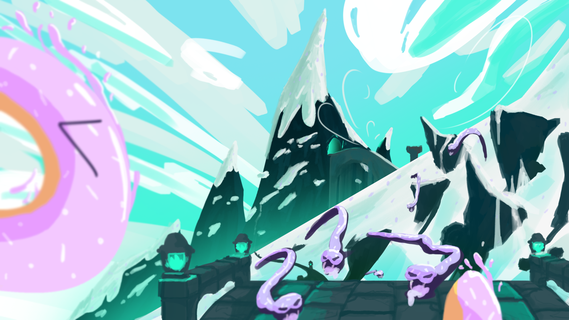

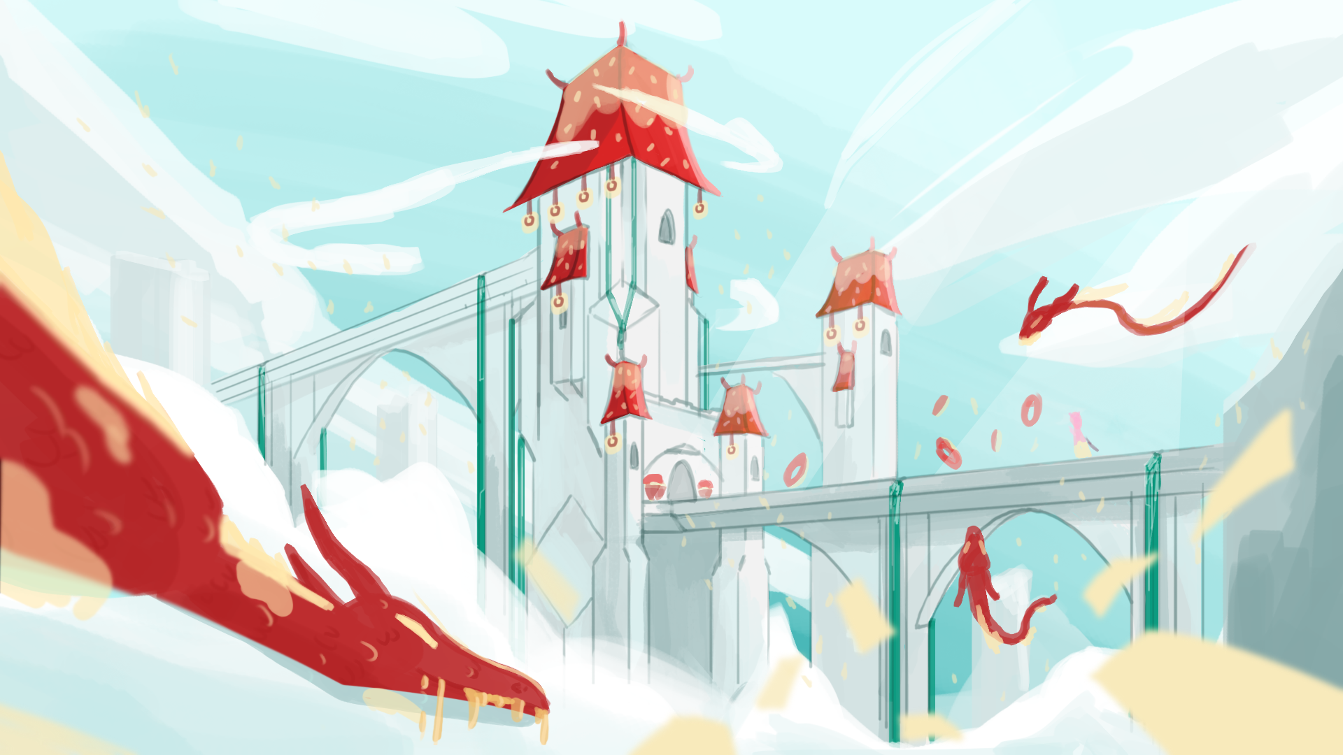

We initially had big dreams for this game; I personally had high hopes for what we could accomplish in 6 months with our team. But, unfortunately a lot of our future plans and concepts were not realised. This included most of the themed levels we came up with, seen on the in-game map, like Dairy Dungeon, Caramel Coast and Chocolate Falls, as well as levels with concept art like Frosting Peaks and Pastira Castle with unique enemies like Eclair Serpents and Caramel Dragons, and unique NPCs like Minty McMelty and King Cookie.
However, I am very glad that we ended up with a playable tutorial and my favorite level I concepted, Strawberry Fields, inspired by The Beatles song by the same name, with the boss Sir S. Shortcake and the Wise Strawberry Willow.


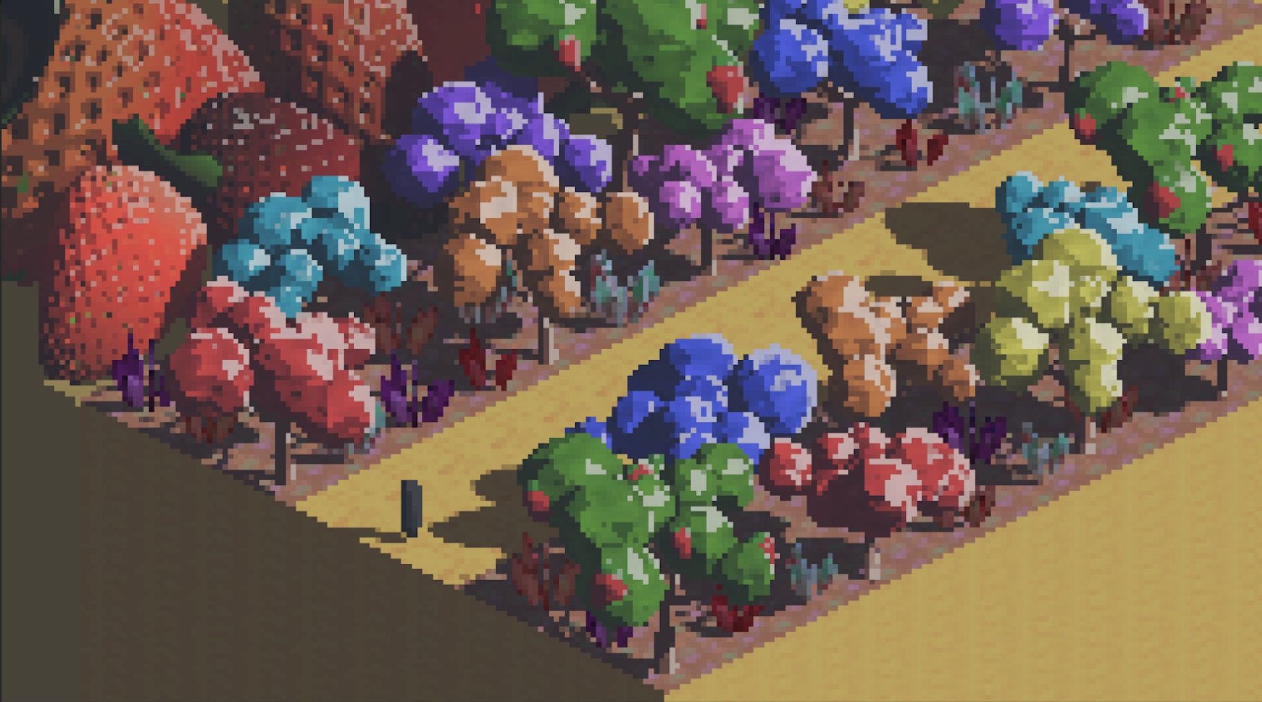

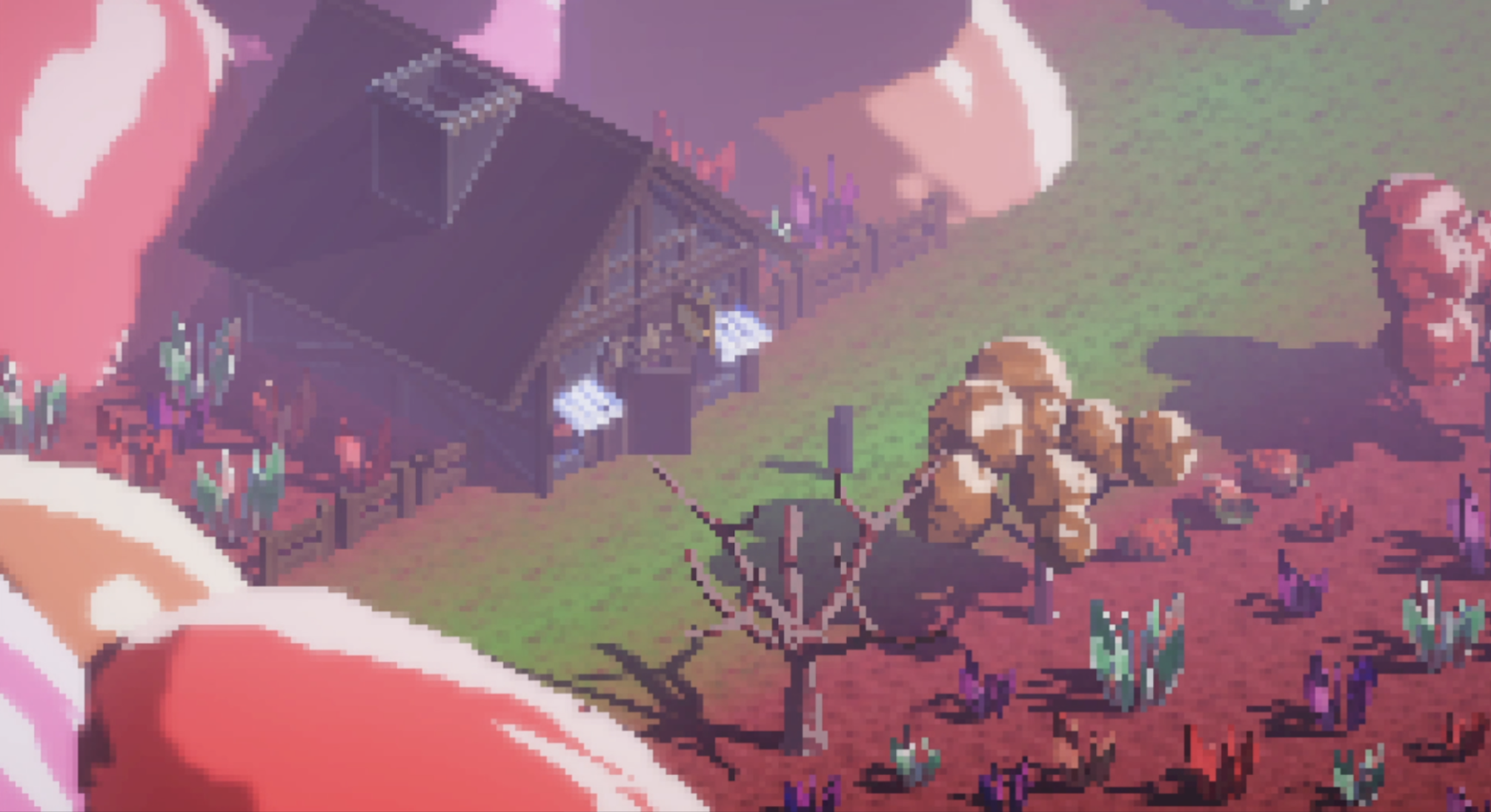
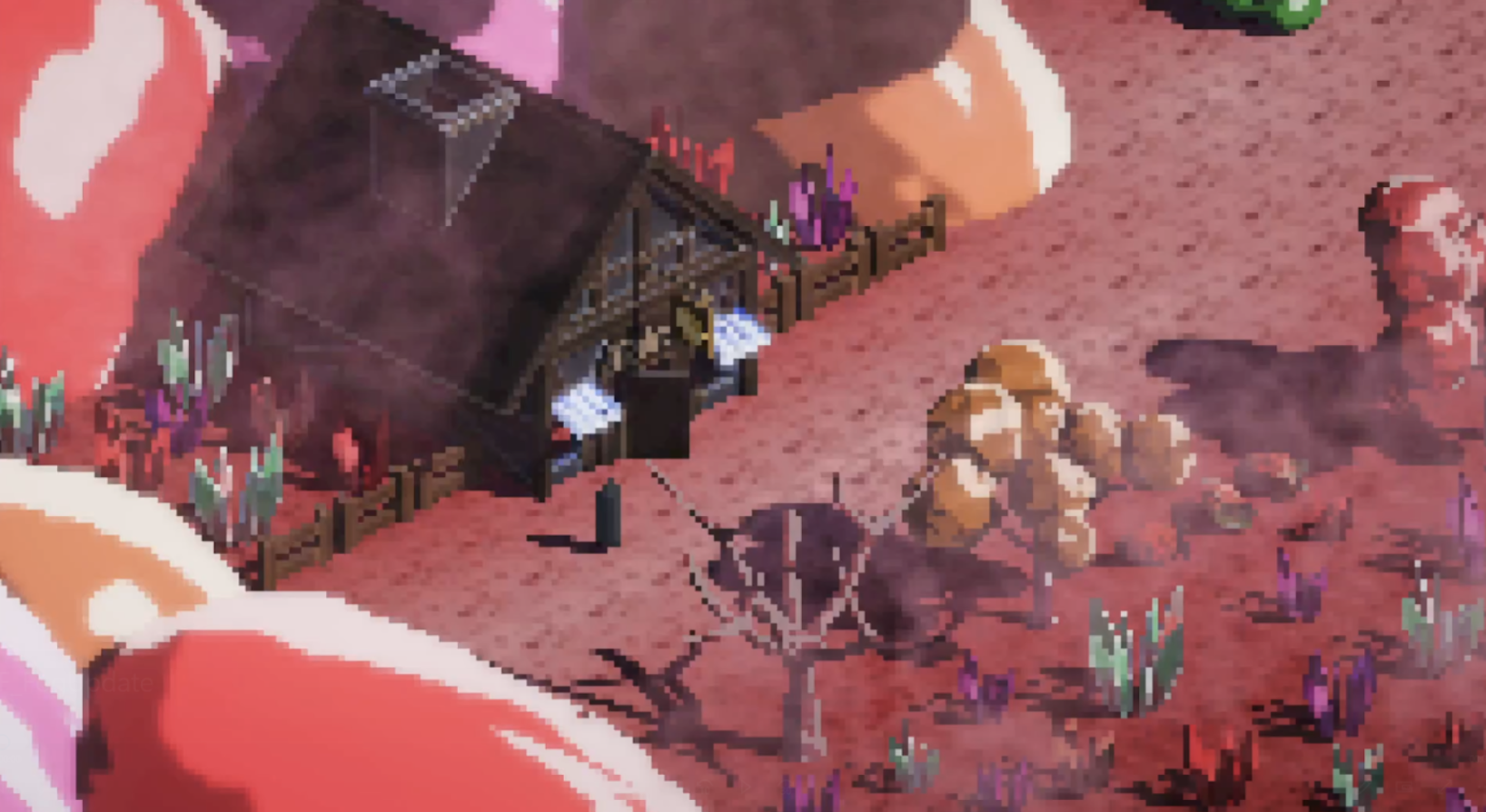
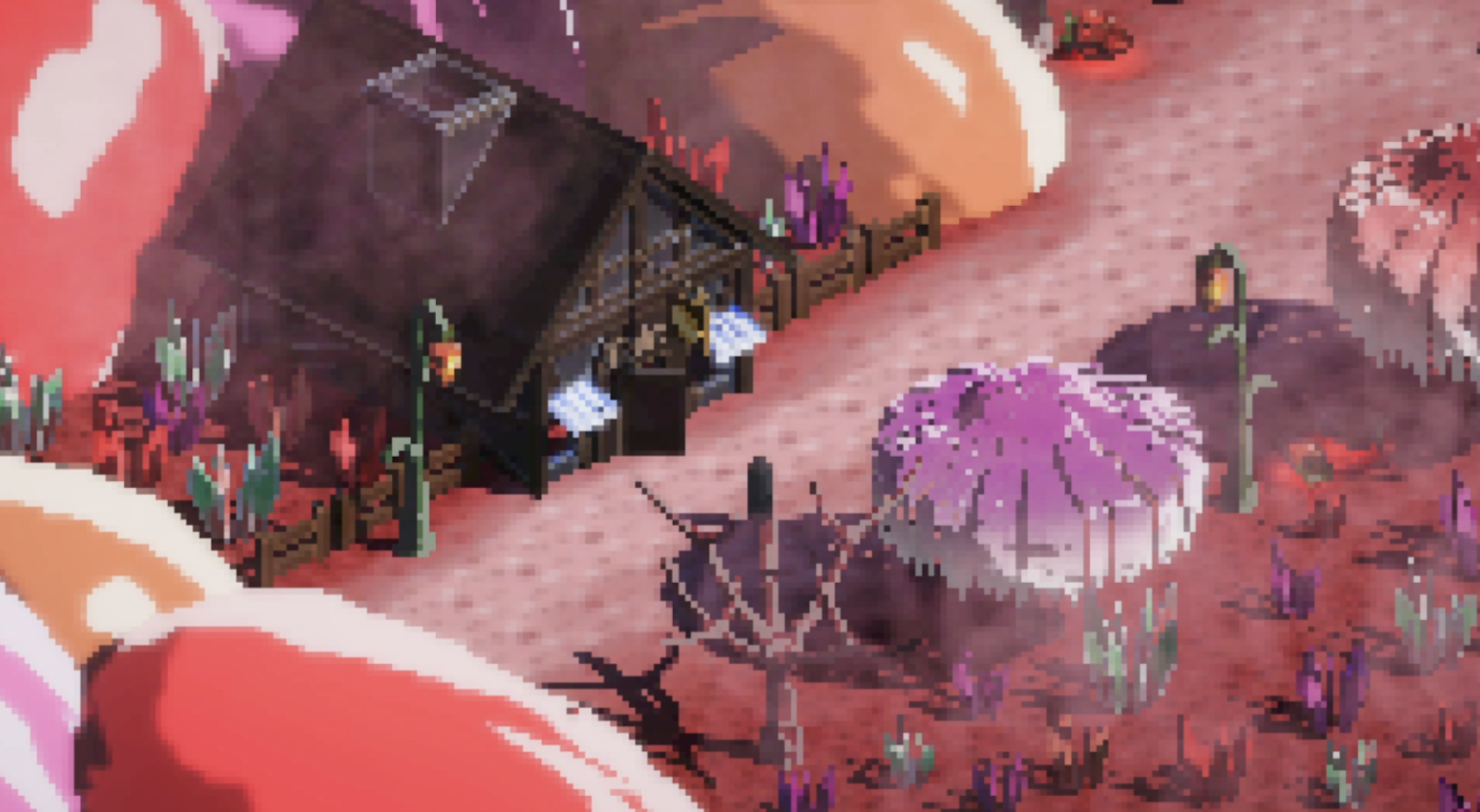
After many discussions and feedback sessions, I stressed the need to be more accurate to the concept art and was met with support from the whole team with the final result.

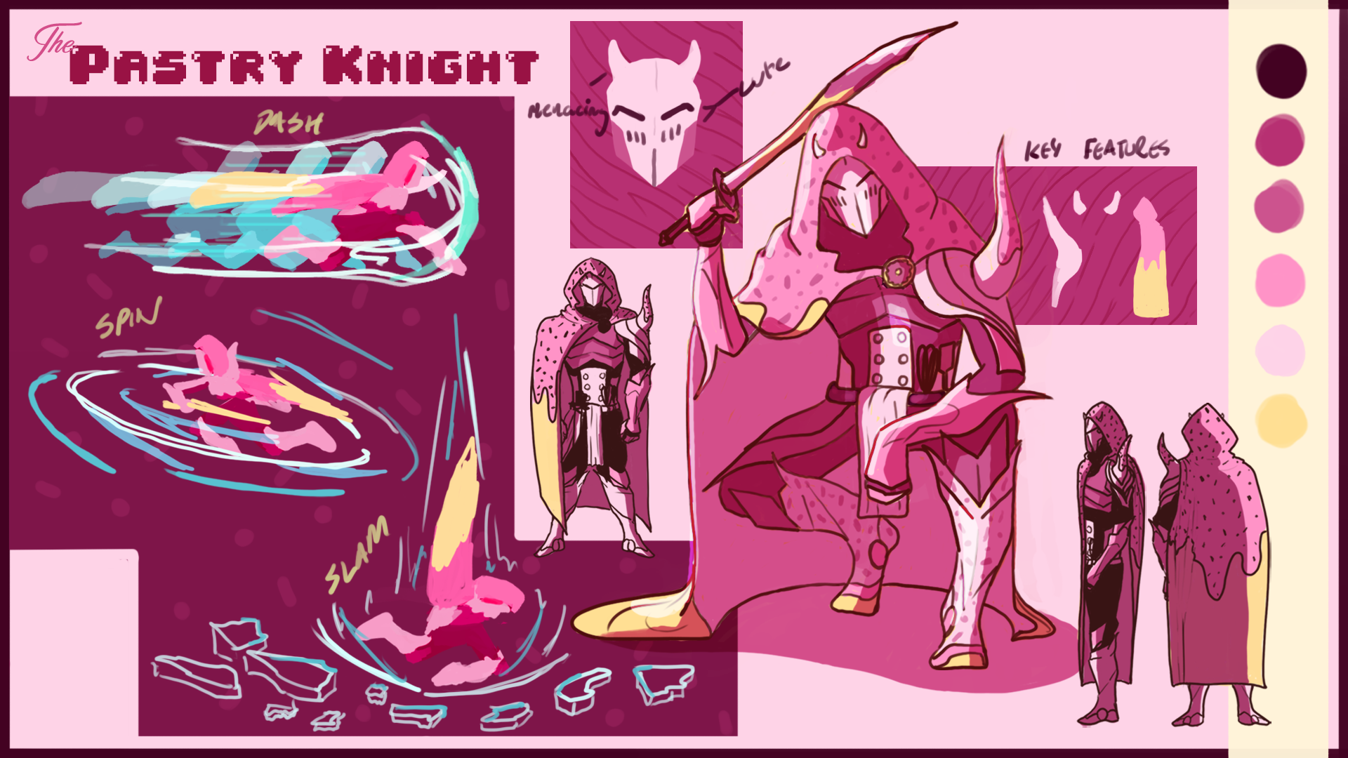
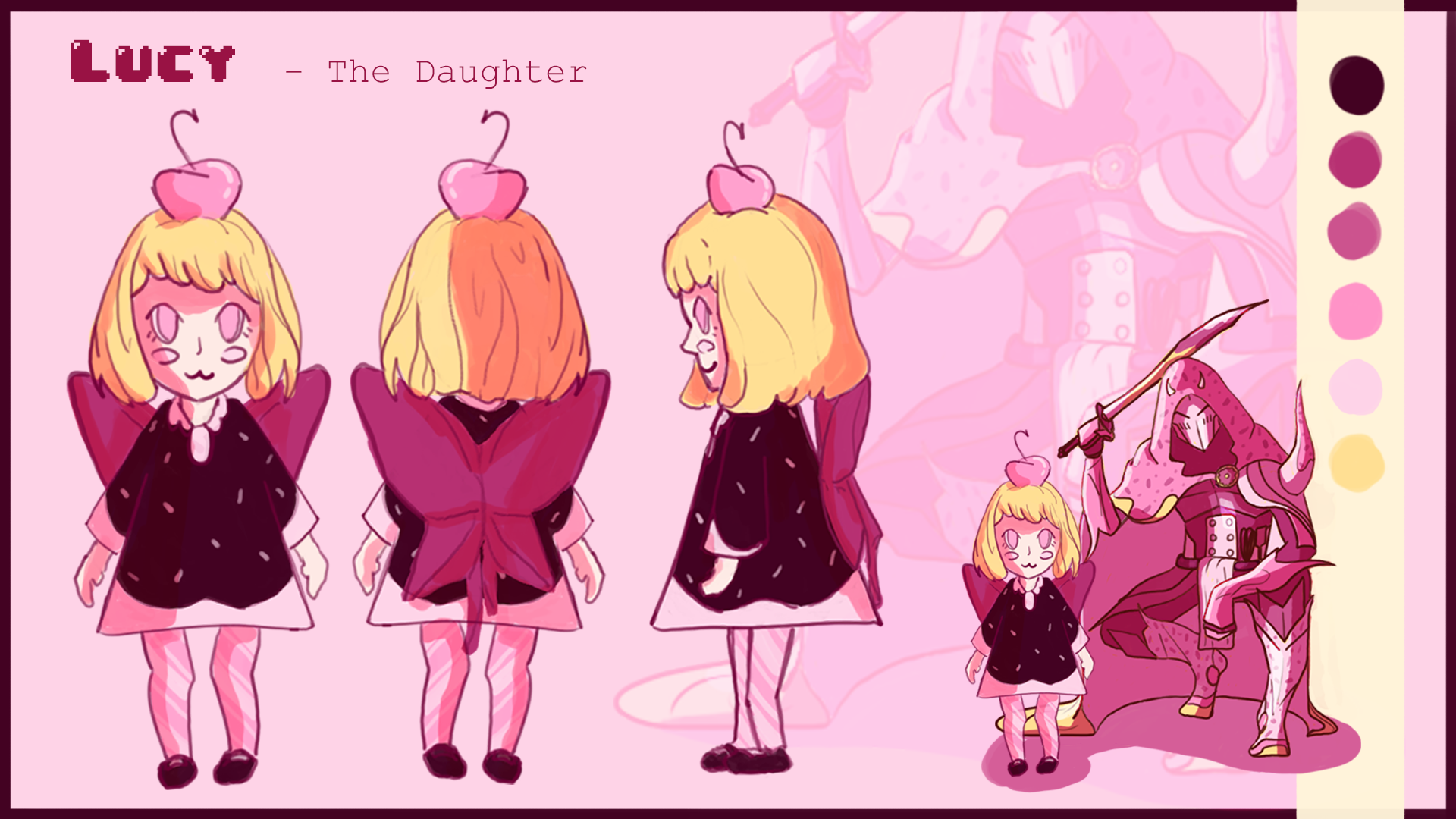

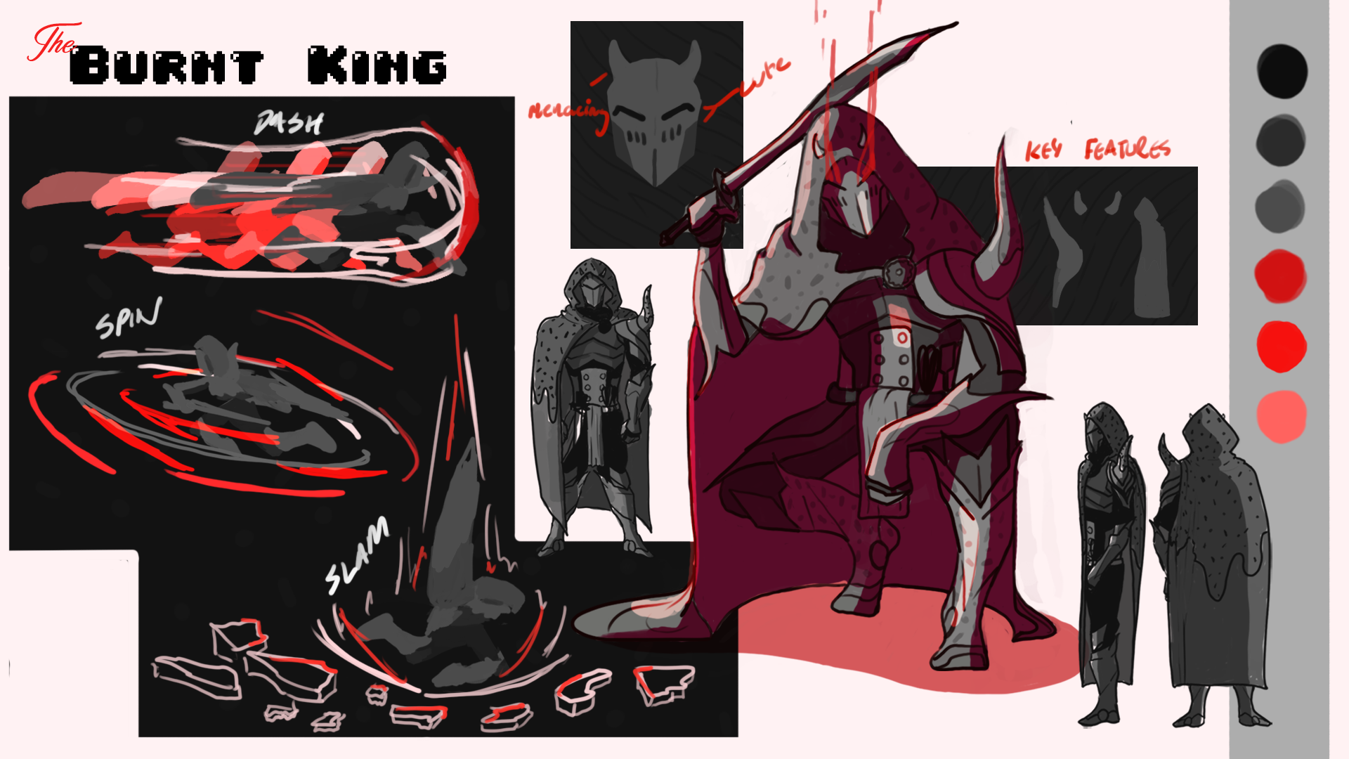
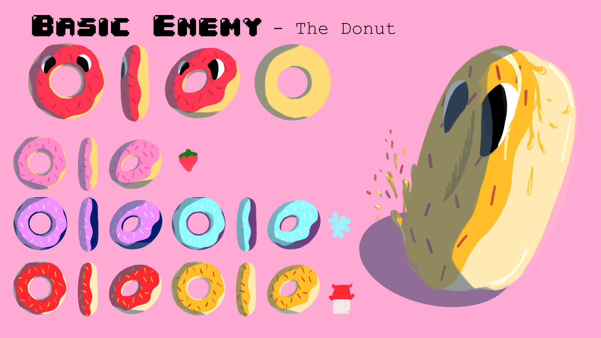
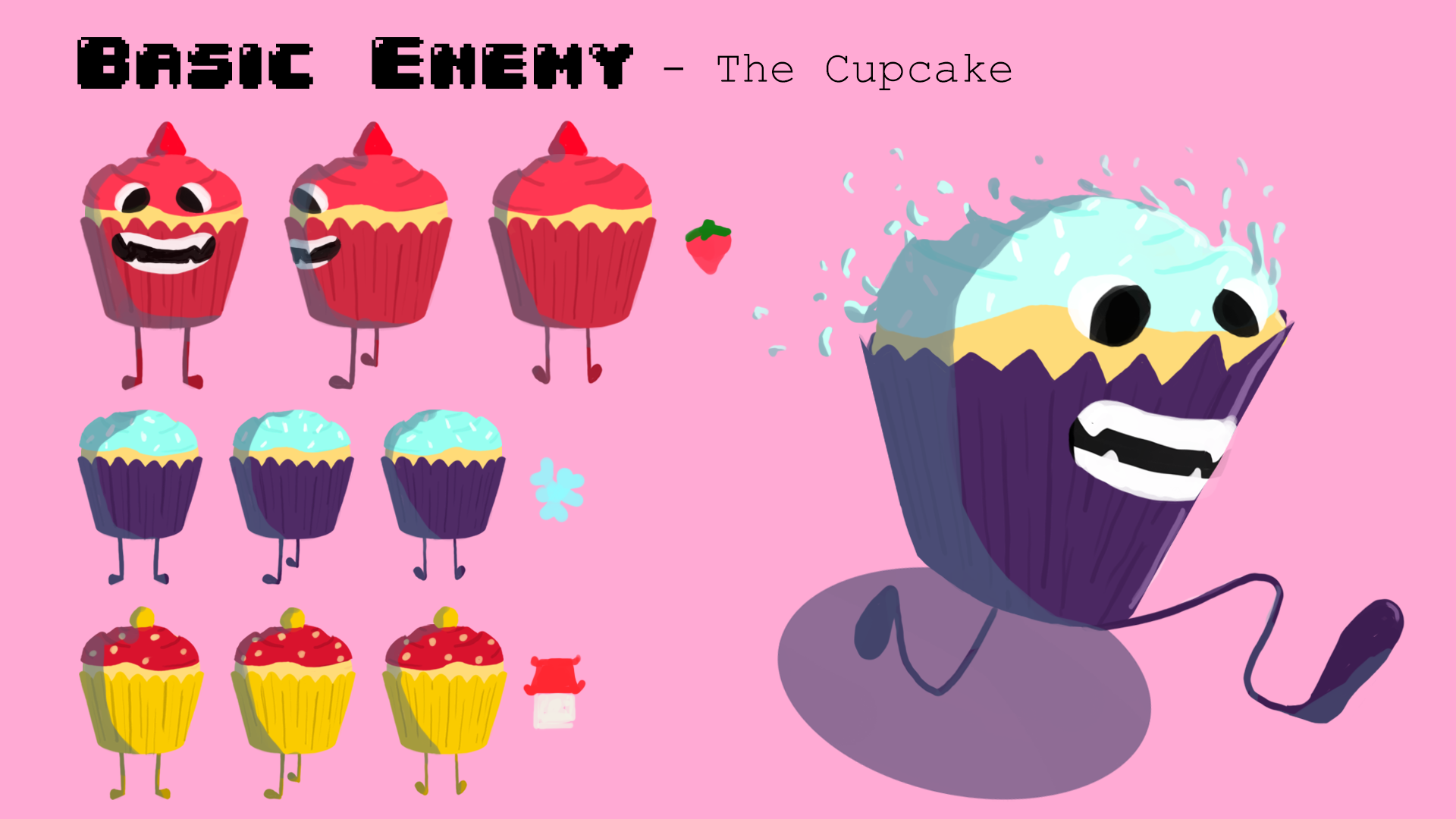
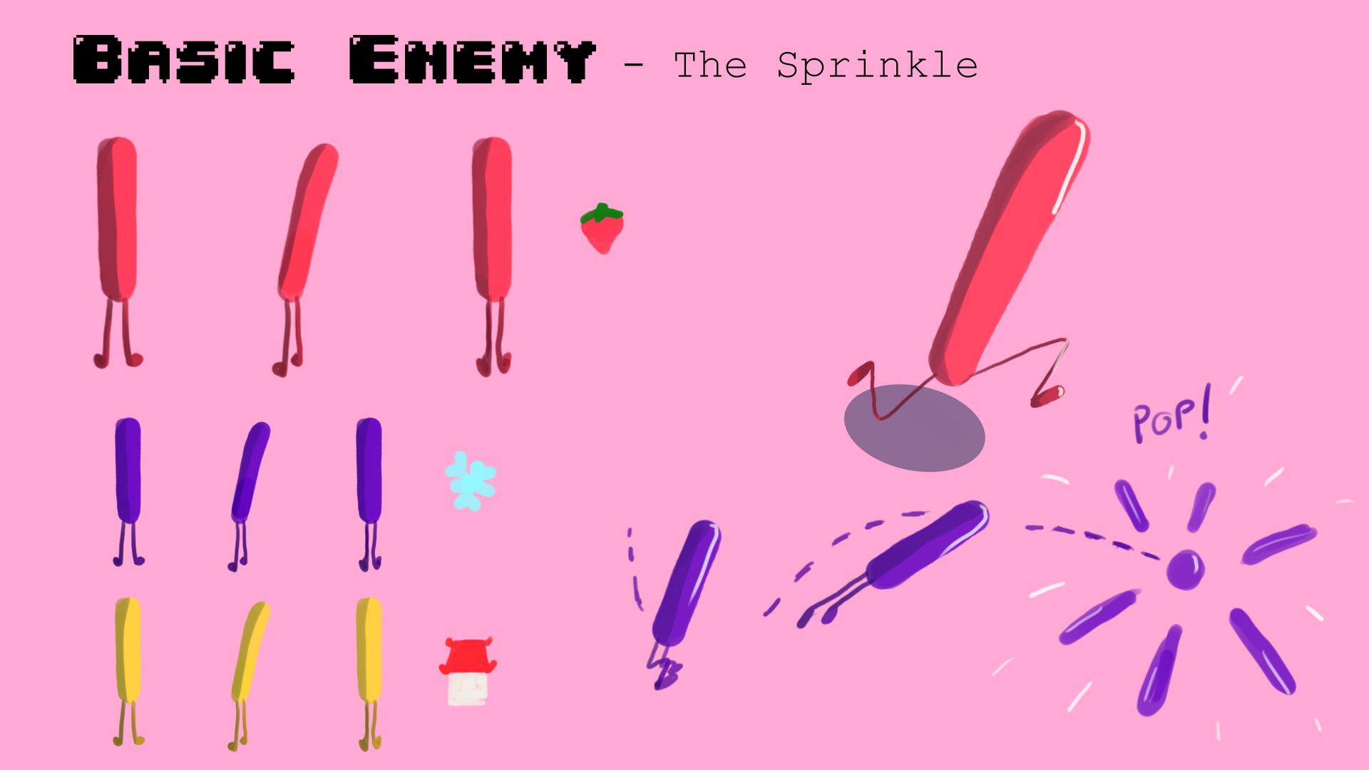
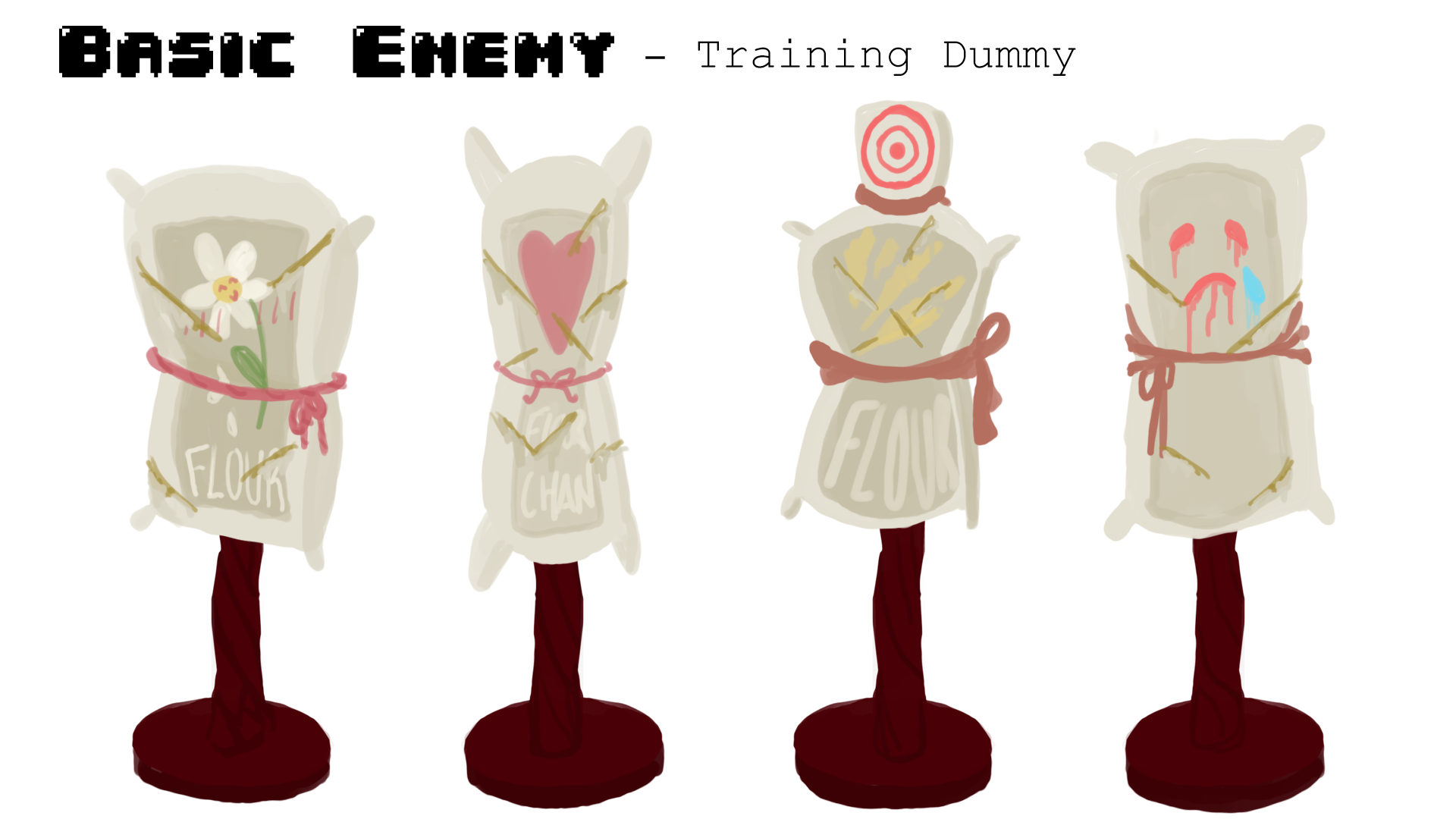
I thoroughly enjoyed coming up with the character designs, especially for the Pastry Knight himself. With input from the rest of the team, splicing together the initial designs, we ended up with a final design I am quite proud of. As for the basic enemies, they were designed in such a way that they could be used on every level with simple recolours. This was intended to help us add many levels within the time we had, increasing difficulty by dramatically increasing their numbers to horde levels supplemented by unique enemies in each location after the first level.
I gained a lot of experience and knowledge in so many aspects of Game Development, culminating into a game I am truly proud of despite my originally inflated hopes. This was across multiple disciplines I have a deep passion for, particularly with the specific classes I took in Concept Art, Game Design, Storytelling and 3D/Animation. My main contribution as the appointed Art Director gave me the opportunity to see what it is like to have the entire visual identity of a game resting on my decisions and find out how it is like to lead a team in this context. Although it came with heavy responsibility that I usually am adverse to (like in other jobs I've had), as my dream is to work in this kind of role in games, I truly loved doing it in this context and found it easy to be motivated.
My main areas of interest in Game Development lie in 2D Art, encompassing Concept Art and UI Assets, as well as UX and Game Design. I found that this project has helped me grow in skill and finesse in Art, and my understanding of Game Design and Production processses. But to my surprise the most valuable lessons I gained were in interpersonal skills and team management.
My greatest pride is the feedback we gained during the Expo. We had mixed feedback on all aspects but were praised a lot on our visual style, the concept art and promotional art, all of it which were my primary responsibility.
If I were to tackle a project like this again, I would focus more on pushing the other artists in my team to collaborate better so we can all improve from each others experience and expertise. I felt they needed more of a push and validation to keep them motivated to contribute more of their own ideas. As an Art Director, I would plan the artworks we needed more and delegate them to be more time efficient, allowing more to be produced at a faster rate so our 3D modellers can achieve more too. This would allow myself more time to focus on other aspects of the game like helping 3D model assets for future levels since my biggest regret lies in the cut content we had so much excitement for.