
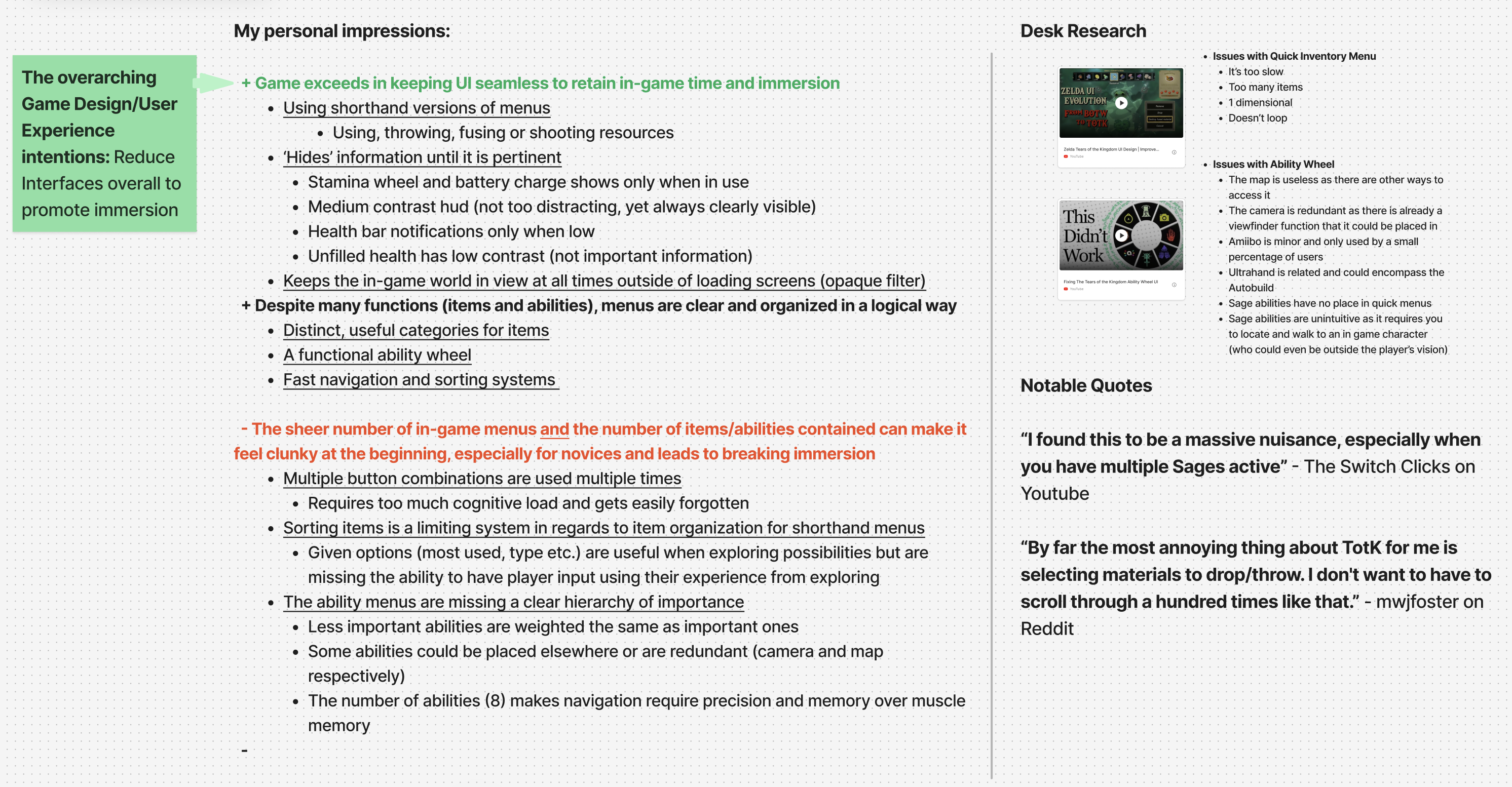
I decided on this topic for one main reason, I already love the UI in this game and found it to have solved numerous issues I had with the previous installment in the franchise and I can tell the UX Designers who worked on it had clear intentions related to the overall Game Design that led to every aspect of the UI. However, despite this and how objectively effective the experience using the interface was, it is criticized often by me and many others for the new problems created that go against the overall Game Design philosophy. This inadvertently made me curious to see if I could use my new skills to improve upon a design that is already so effective and that I have personal understanding of.

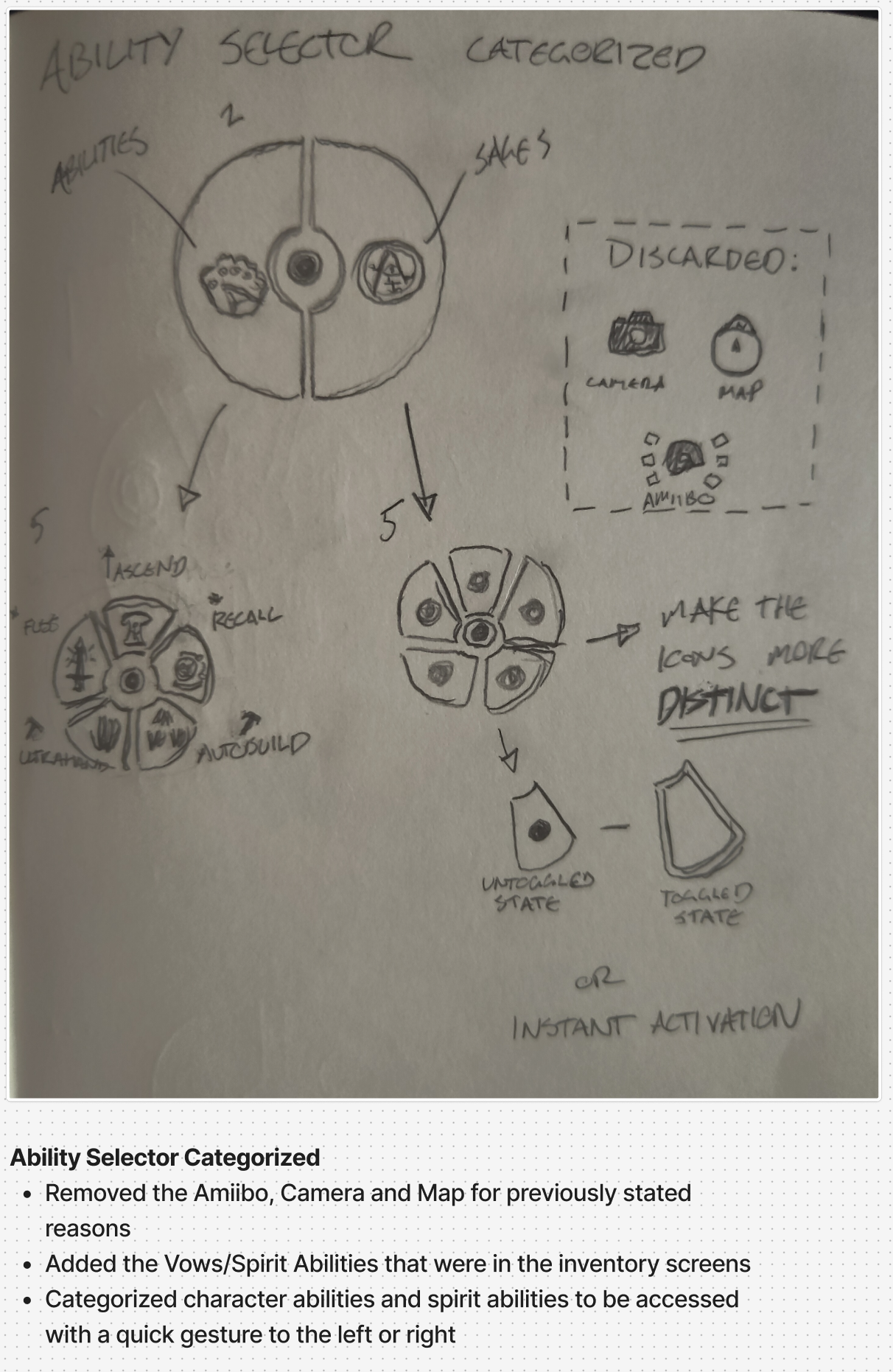
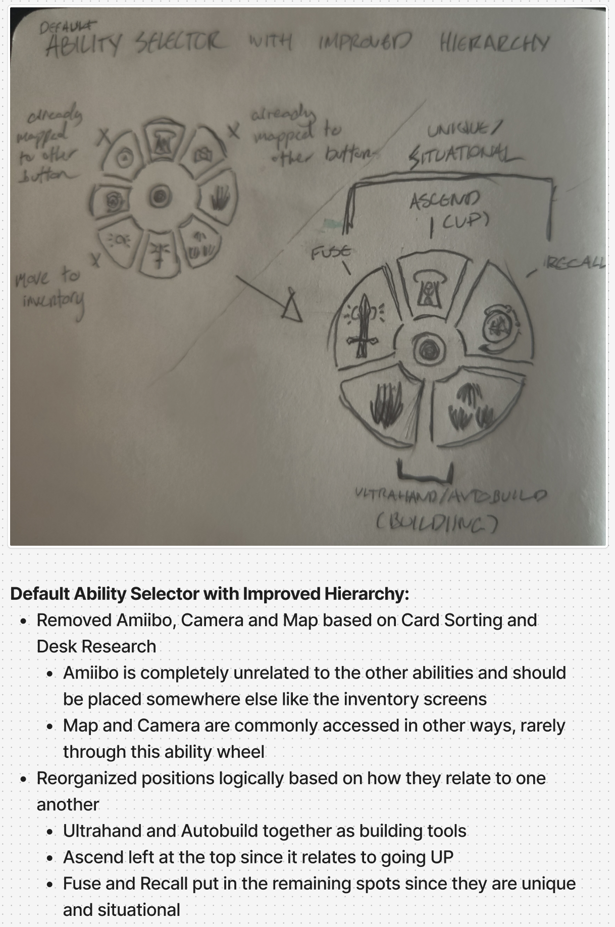
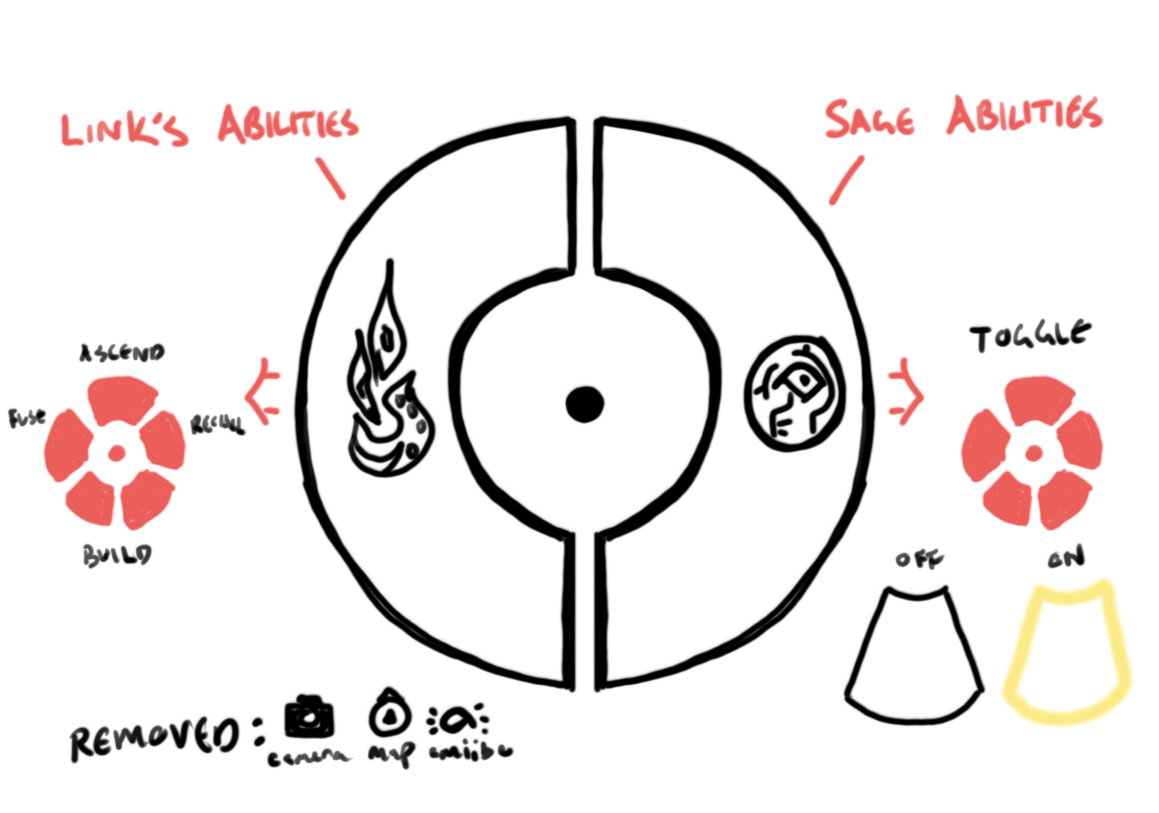



I realized quickly while making the default states that having two wheels would increase the number of clicks and thus add to the micro-decisions and increase bandwith required when using the menus, so I quickly decided to abandon the first section splitting the sages and abilities and instead integrate them into one menu. This may sound like a minor issue, but as the menu is used the most often in the game, an additional click, decision, seconds all add up so pursuing even more reduction is the optimal way.

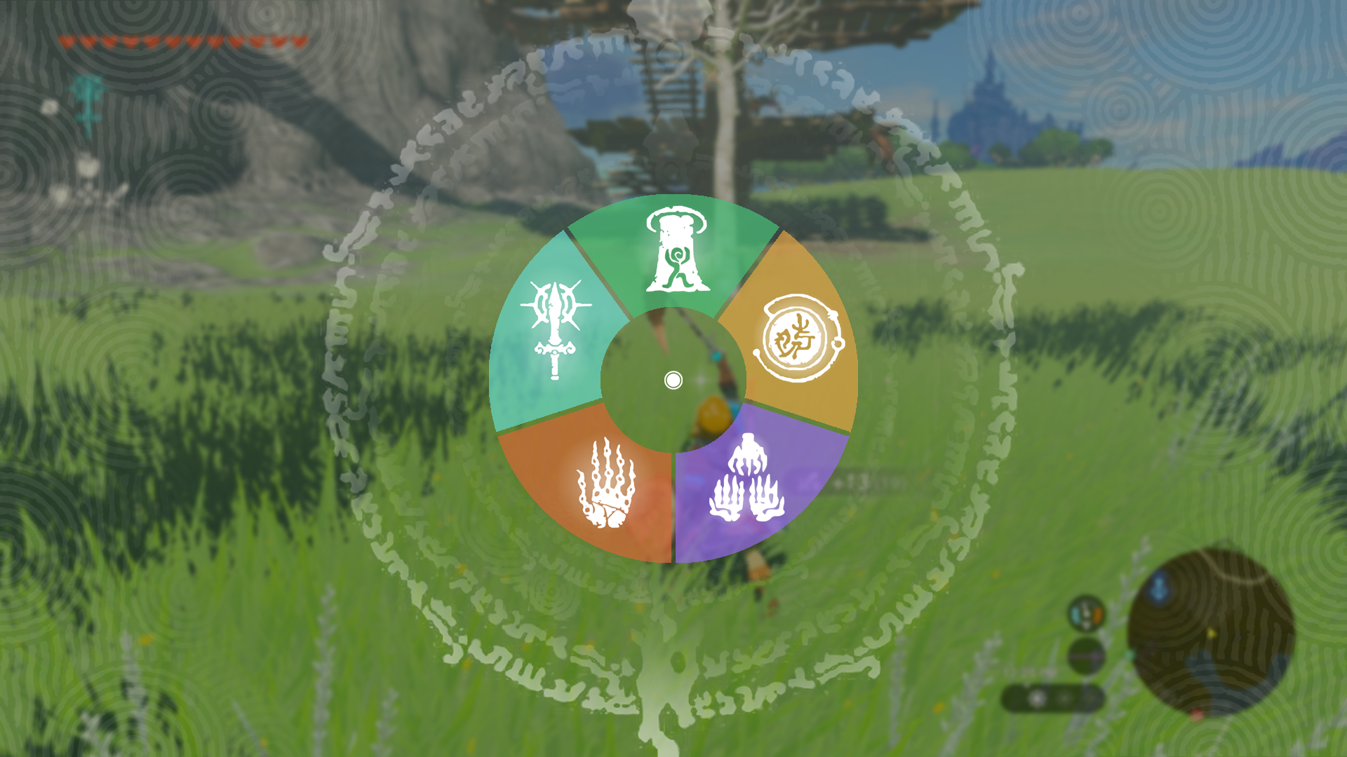

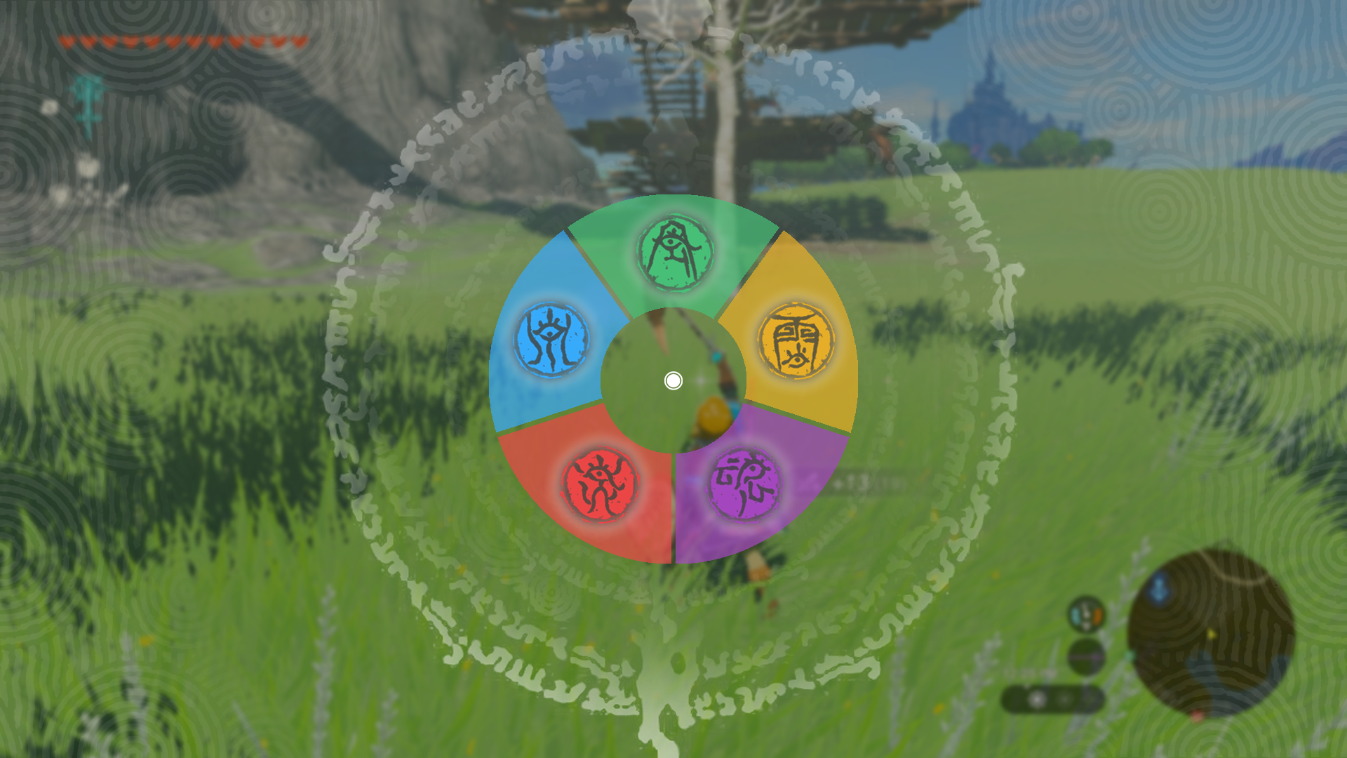

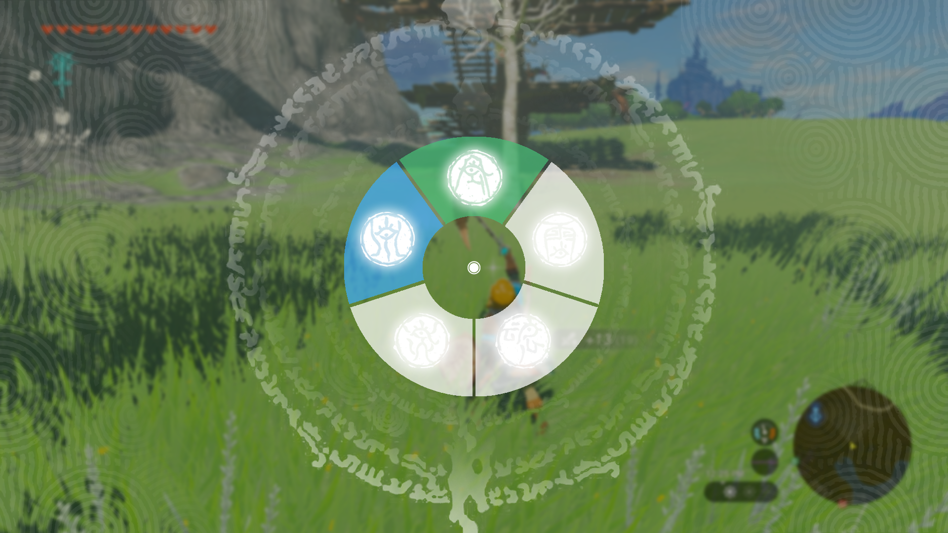
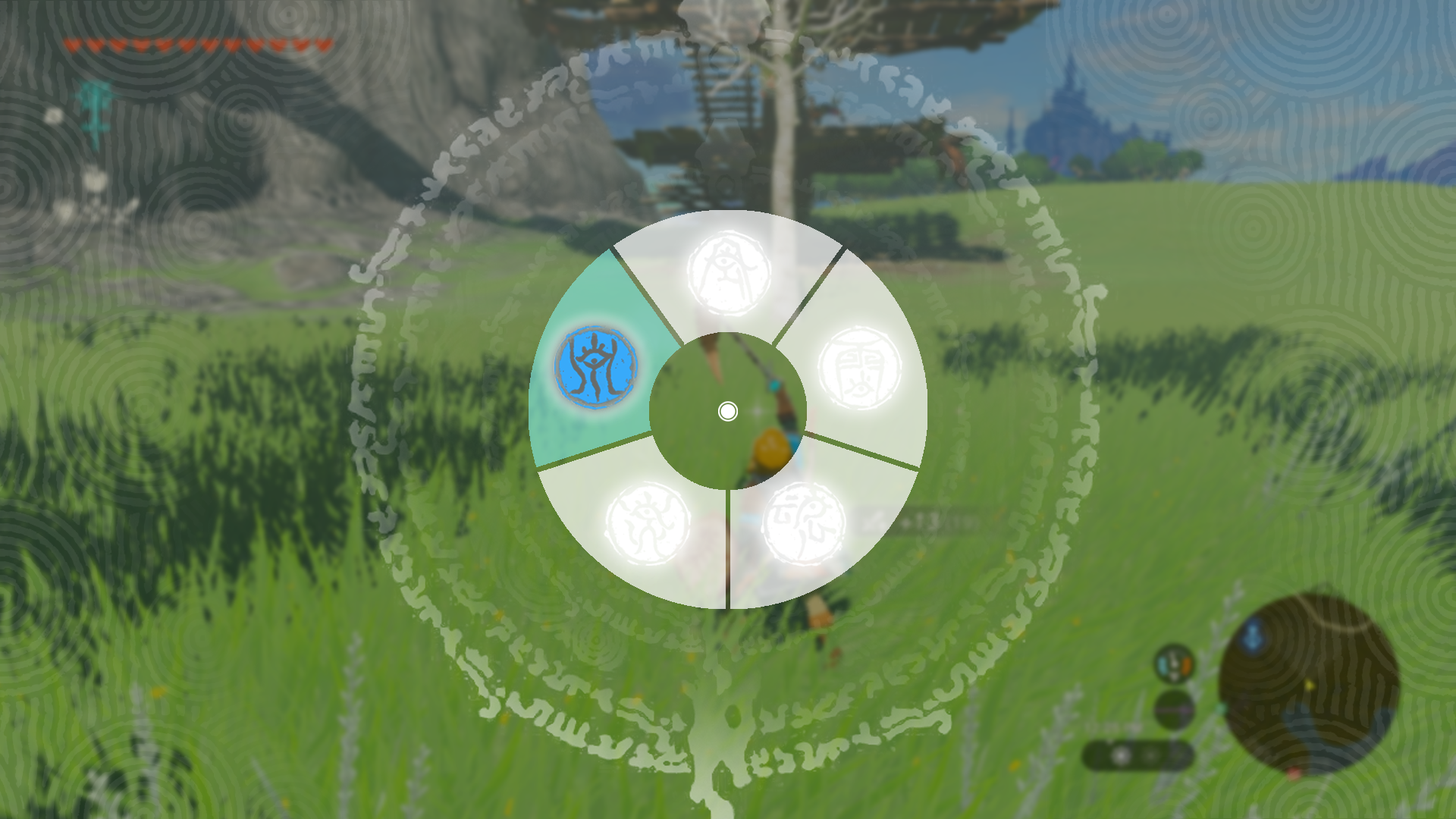

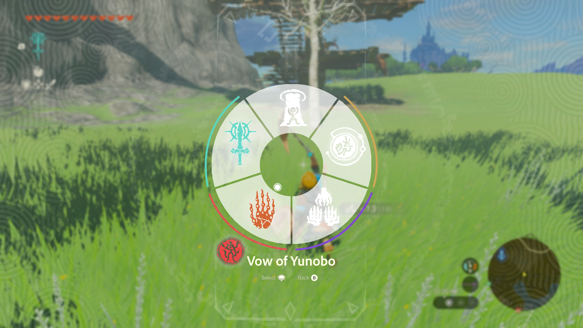
While creating the mockups, I realized by allowing players to toggle the sage abilities from the ability wheel, I can reduce the UI even further by halving the amount of clicks. This would require holding the stick against the ability with the corresponding sage color.
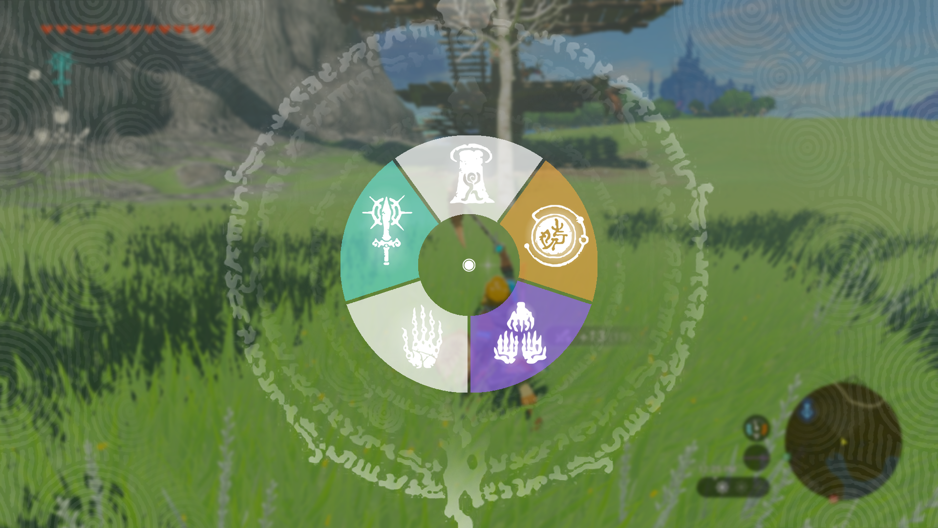

Default with Current Ability and 3 Sages Active
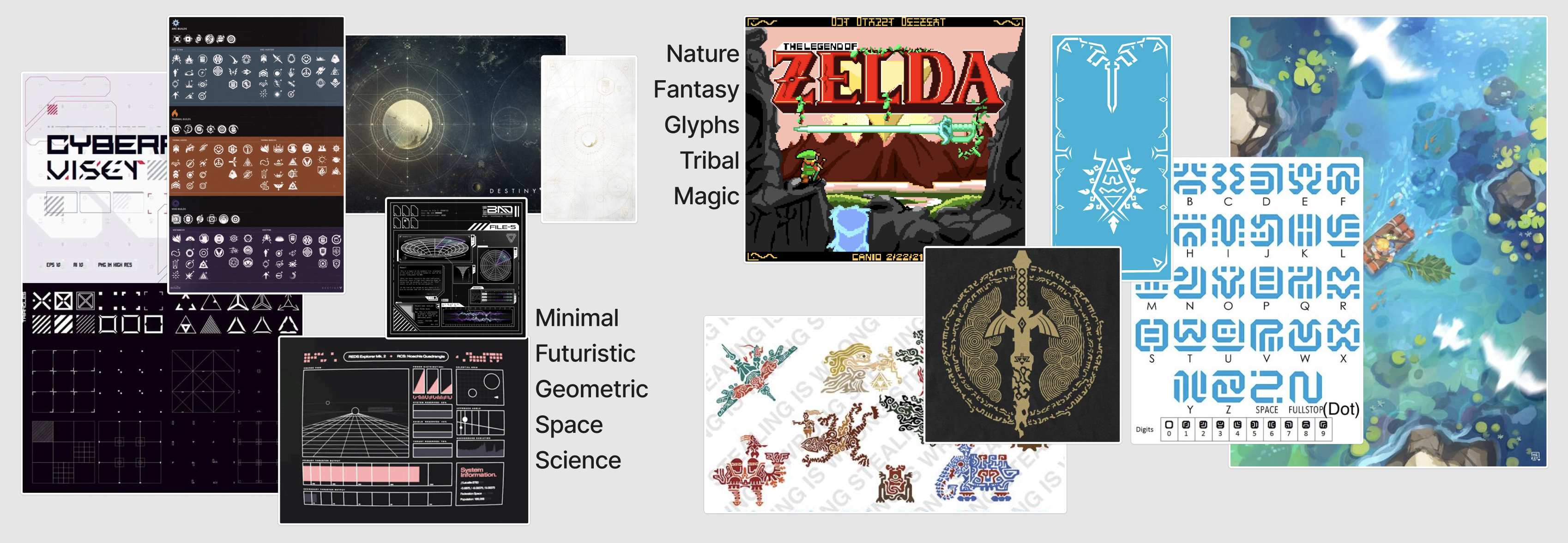
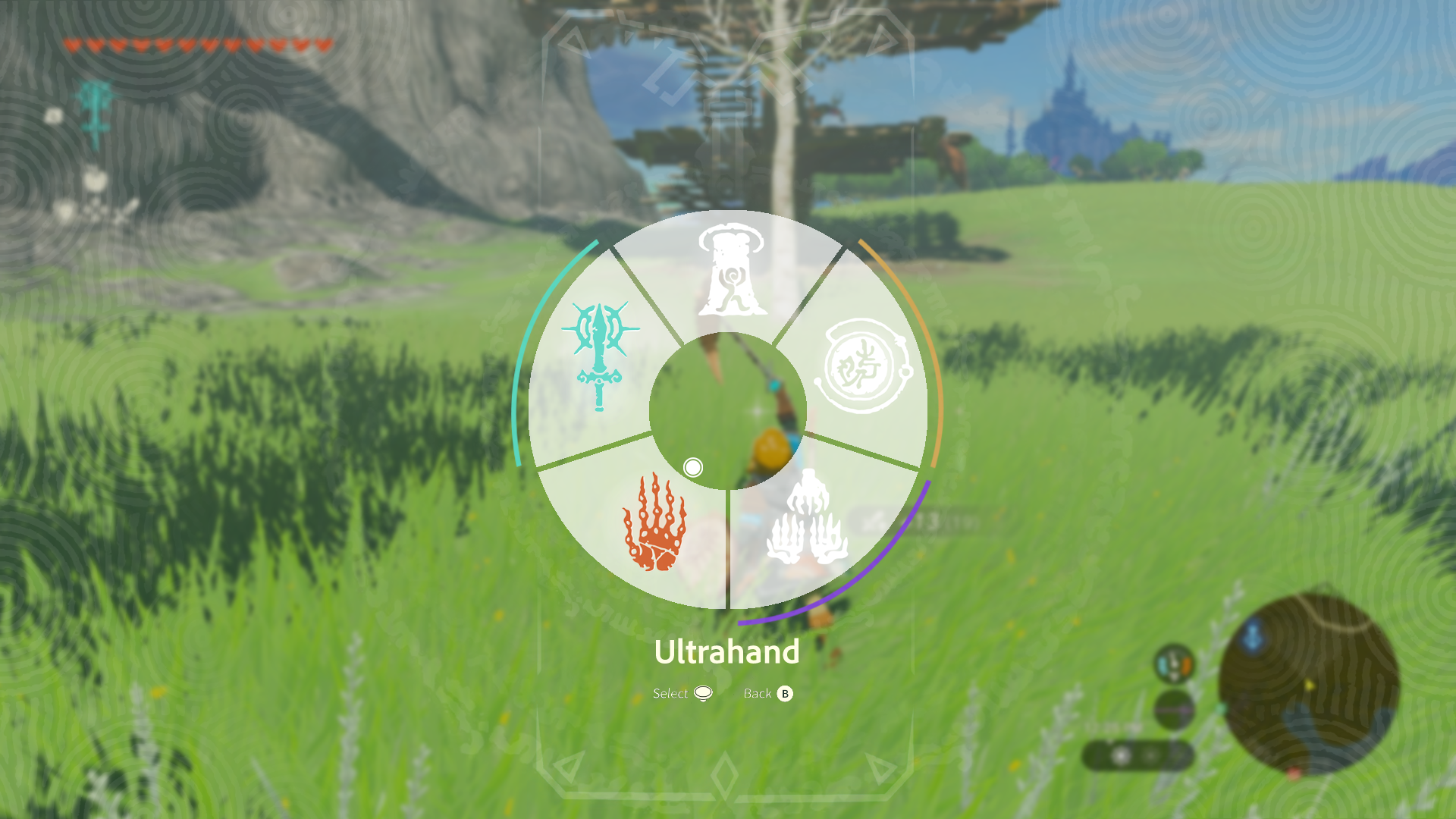
This design prioritizes sleekness and futurism in its aesthetic while retaining the tribal patterns prevalent in the original in-game technology. It does this by providing as much information as possible with the least amount of obstruction to the in game world. This is inspired by the reductionist design philosophy exhibited throughout the game, for example in the hidden-until-pertinent stamina wheel.
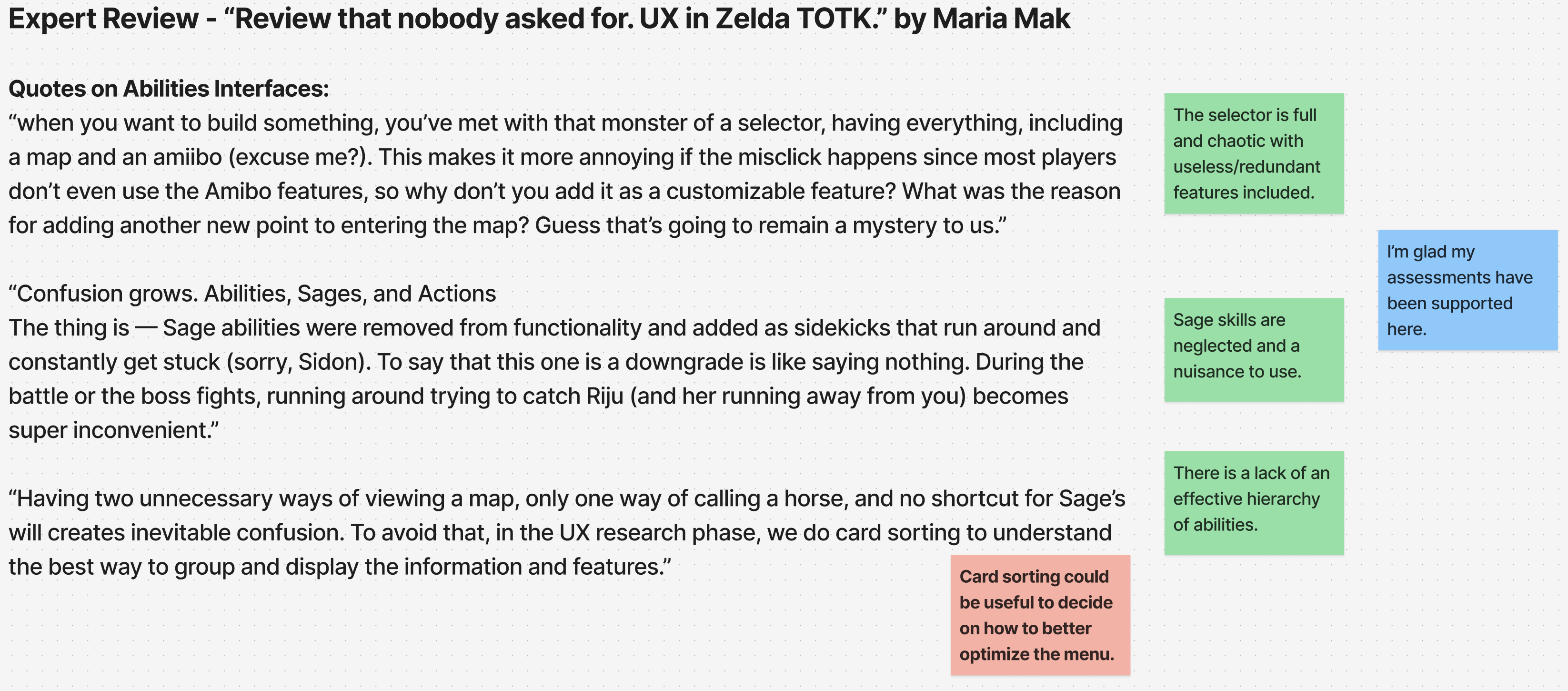
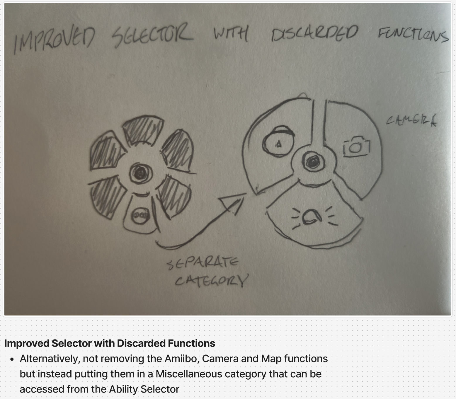
Other important changes include removing redundant/irrelevant features based on research and card sorting (map, amiibo, camera) to hopefully reduce user mental bandwith and allow for faster, streamlined use of the menu. The remaining functions are all abilities and were rearranged in a logical way; ascend at the top and building tools grouped at the bottom.
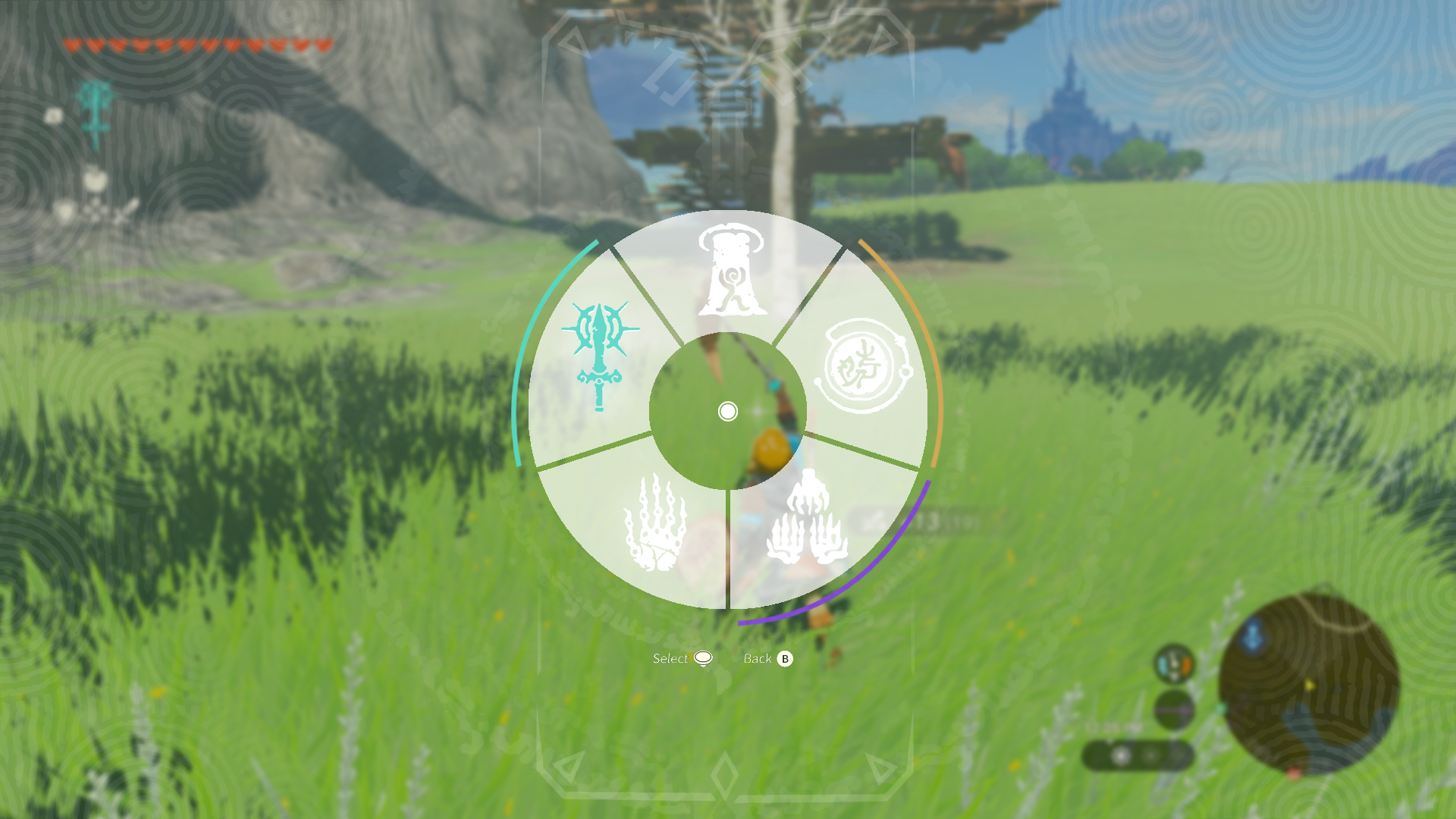
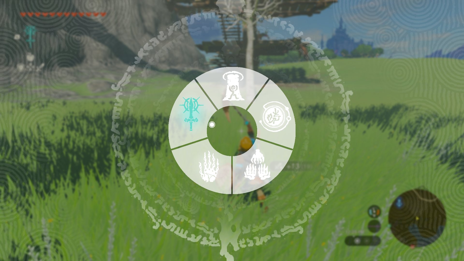
Hover State
Having the center circle react to joystick movement will be most of the visual reactivity needed, aided further by the highlighting of the hovered ability with its corresponding color.
Hover State Held to Toggle Sage
Having active sages displayed will suggest to players a way to toggle them from this menu. This is previously only possible in the inventory screen which I am trying to avoid to keep players in the game world and out of menus as much as possible, in order to keep immersion from breaking. Furthermore, adding a pulse animation after a few seconds hovered will reveal the corresponding sage icon, taking full advantage of the convenient color coding in the original game.
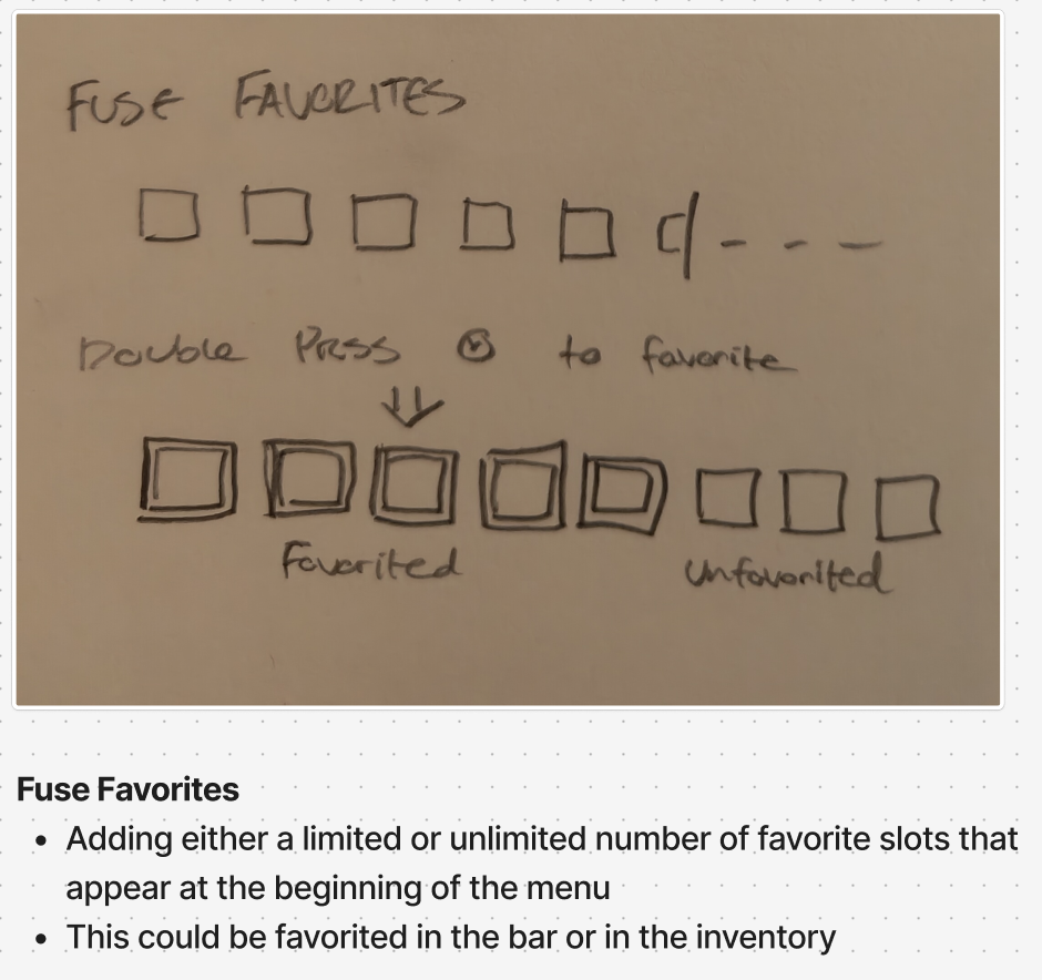
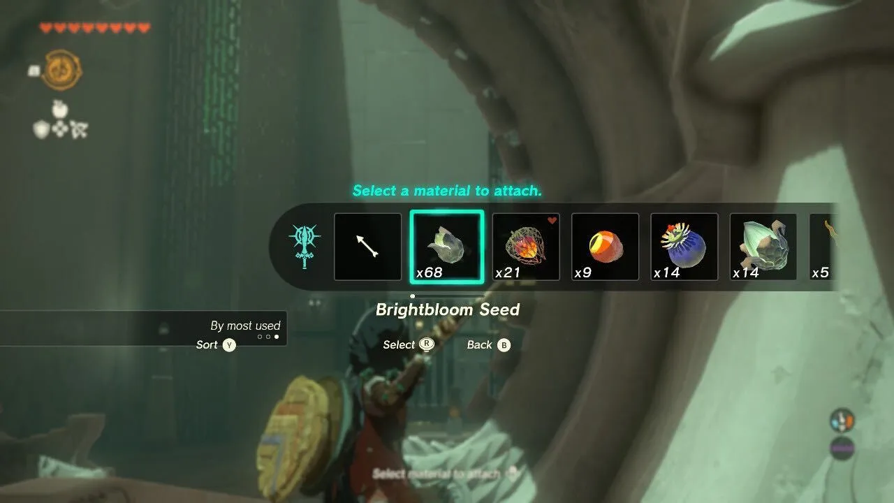
This design keeps with the new aesthetic while adding an important function also aimed at speeding up and streamlining the use of menus to retain immersion. This is done by simply allowing players to favorite certain materials for throwing and fusing. In combination with the sorting function of the original design, it should make the use of the item/fuse menu much faster.
